Lynn Music Foundation
Project Duration June 2023 – Present (ONGOING)
Studio Services: Branding | Website Design | Content Marketing Design | Copywriting
Project Information
Background
Lynn Music Foundation started in 2022 with longtime collaborators and friends, Chris Martin and Edwin Cabrera. With both having long histories in the Lynn local music scene, they collaborated on projects ranging from record label GrindHouse Recordings, to small media production company, AntiHero Studios. Along with third founding partner, Jay Moon, they started Lynn Music Foundation with the mission of giving artists within marginalized communities—across Lynn, Massachusetts and the North Shore areas—access to professional resources to take their musical expressions to greater heights. With the success of their first outdoor community live event, Lynn Music Foundation was finally on the map, and since then has been a growing figure within the downtown Lynn community.
The Challenge
Having now been around and active for a couple of years, the organization still had their initial boot-strapped brand and website presence. With new scaling initiatives on the horizon, along with the acquisition of future venue spots, the organization came to Santoro Design for assistance in revamping the website to not only be more visually impactful, but to allow for a more seamless and interactive experience for members.
Our Solution
We engaged the Lynn Music Foundation team within our Brand & Website Essentials project package. Working alongside the co-founders, we created a new brand strategy that places the artist as the hero and narrator of their own story and artistic voice. Supplementing that with a visually bold, revamped identity system that can adapt the traits and sound of music genres, we also designed and built a brand new website that allows for members to book live venues and studio space rentals within their account.
Brand Strategy
Since the release of "School of Rock" in 2006, many music schools and organizations have adopted a similar approach to teaching music and fostering creativity. What makes Lynn Music Foundation unique is that it focuses on supporting artists who already have a clear sound and process. These artists primarily need access to the resources necessary to create their music. Living in Massachusetts can be expensive, and most artists cannot afford high-quality recording equipment or studio rentals. Additionally, they often struggle to find live performance opportunities. Lynn Music Foundation addresses these challenges by providing artists with top-notch equipment, studio space, and access to local venues and events.
Our Discovery Phase made clear to us that the true hero of their story was not the foundation, but the artist they serve. As an organization “made for artists, by artists,” creating a diverse community of artists was a must. To become the platform for young and aspiring artists they wanted to be, we identified their brand attributes as Emboldened, Welcoming, and Uplifting. Along with competitor/SWOT analyses and additional user persona development, we crafted a compelling brand manifesto written to invigorate and initiate prospects, while also aligning internal staff on the mission.


Brand Identity
Since the organization had a good reputation in the Lynn community, we decided against a complete rebrand. The monogram mark, made by co-founder Chris Martin, already had brand recognition, so we just gave it a small update. However, we did revamp the rest of the brand identity to align with our goals and attributes. We came up with the idea of a "fluid" logo that could change to match different music genres, inspired by brands like MTV and Complex Magazine. We created different versions of the logo that could be used in patterns, on clothing, and on branded materials.
By creating stylescape boards, we finalized the creative direction for the new identity system. The brand's visual language uses Field Gothic font for hierarchy, along with dark, contrasting colors and textured layers. We created custom illustrations for initial apparel designs, but in the future, we aim to collaborate with local artists for a more cohesive presence.

This gave way to the idea of a “fluid” logomark that could adapt to, and take on, the visual traits of different music genres.


Interactive
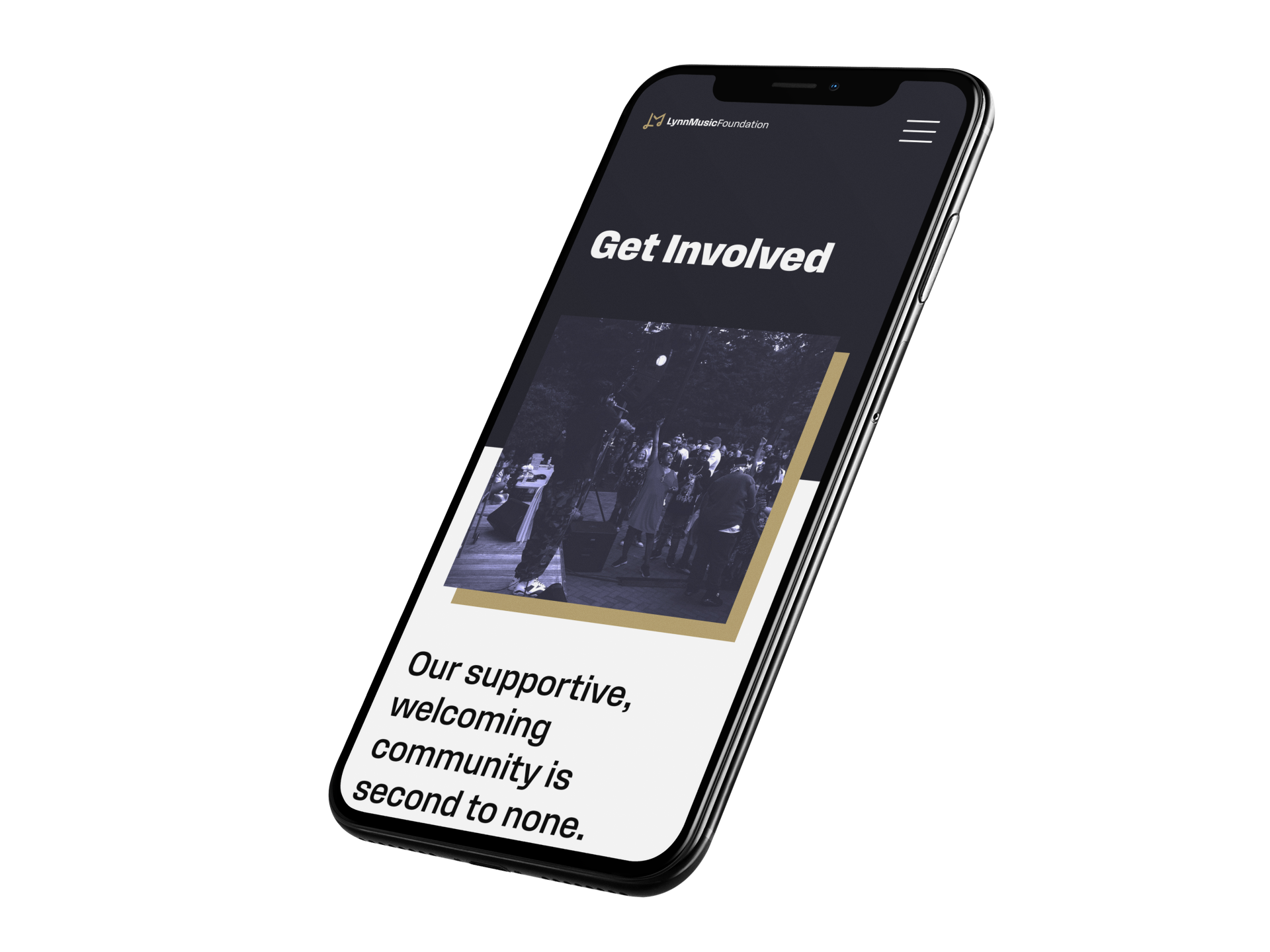
The site was originally created quickly to apply for grants, but it needed a revamp for future growth. The main challenge was to allow each member to create their own account and book venues or studio space. We started by creating templates for the main pages and sub-pages like team bios and venue pages. Members could book discounted reservations on each venue page. We decided to build the site using Squarespace Fluid Engine for its limitless customization and user-friendly CMS, with Acuity Scheduling for booking. We also made separate dashboard pages for each membership level, where members could instantly book studio or venue space.
With the new brand design, we created a library of reusable design elements and patterns for the website. This helped us design the pages more efficiently and allowed teams to quickly create and approve new pages. We also added scrolling features and hover effects that were tested thoroughly to ensure they worked well on all devices.


