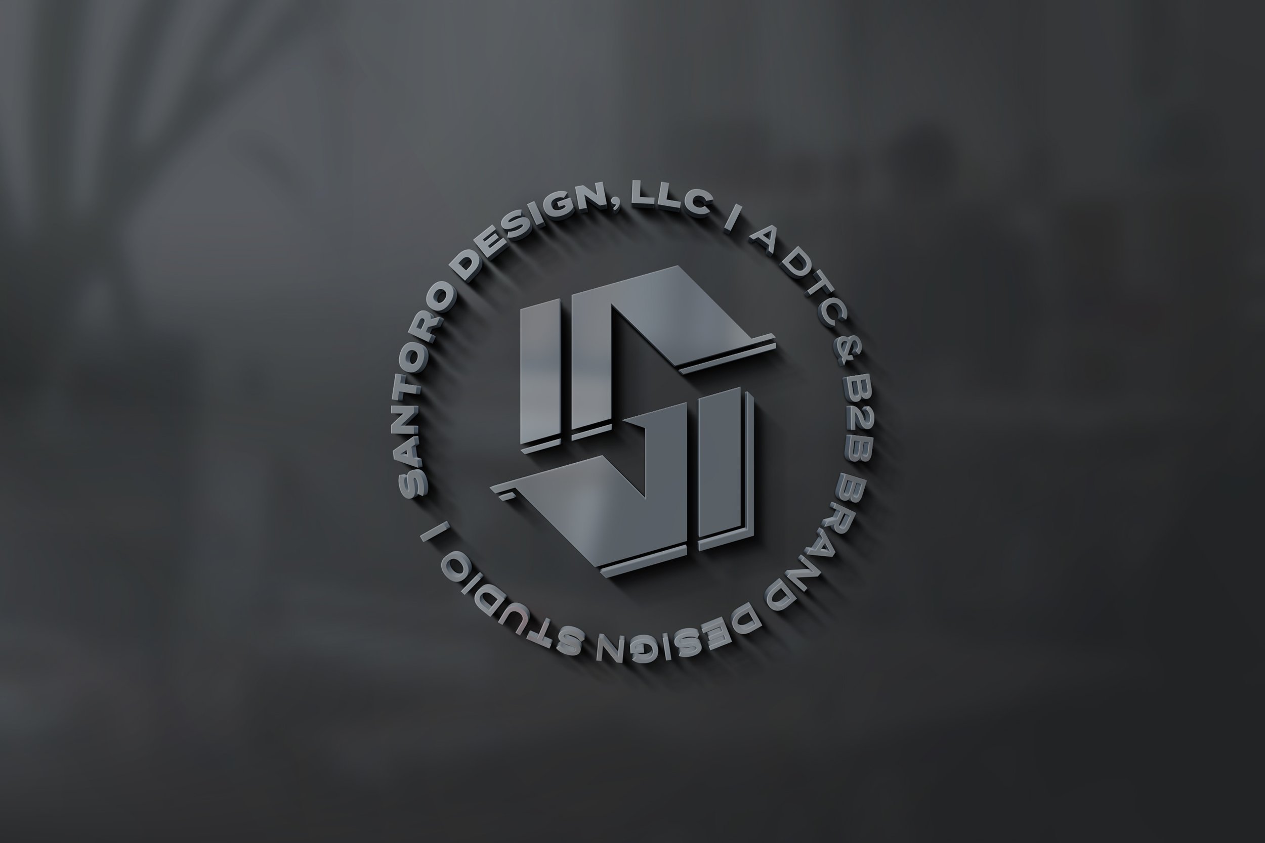
New Year, New Brand
It’s definitely been a while since we’ve posted, shown, written…yeah, it’s been a while since we did practically anything except work! So to start of 2022, we’re writing about the biggest rebrand undertaking we’ve done in a while: Us.
Like any business in these weird times, the studio is no exception with having to roll with the punches. Throughout last year, we were hunkering down on a number of projects, but namely one: creating a new identity system for our design studio that spoke to our vision moving forward. Given our 10 years being around, this was going to be pretty hard. Especially after our last website redesign from two years ago, why even go through such an exercise?
Starting From Scratch
For us, the writing was on the walls. Our branding was too edgy and felt very tech—like something out of TRON or Tony Stark’s scrap pile. Everything felt too loud, too bold, and in general felt like it was trying too hard. The visual elements we had were too inflexible. Furthermore. we knew we wanted to make a statement about “bold” and “authentic” branding, but what did that mean to us on a deeper level?
We knew that to grow this brand and revitalize the studio, we needed a clean slate. By treating ourselves like a client and going through the same brand-building exercises, we knew we’d find a way towards a more holistic identity.
Dressing For The Jobs We Want (More Of)
Ever since we started back in 2012, we’ve always prided ourselves on being a successfully generalist design studio. By specializing in branding, it meant we could get our hands on everything from print to web projects. This is something we’re still proud of, and we want to continue.
Throughout our years, we’ve always had a soft spot for DTC and e-commerce brands for their exciting new products, innovative vision, and their inherent tie to our daily culture. Combined with our long-standing work within the New England tech and B2B community, we felt like we’d have the best of both worlds, with a focus on more human-centered work.
The Visual Identity
If you’ve had your eye on this studio since the beginning, it’s pretty evident we’d gone through a ton of changes. From young and aspiring, to overly edgy, what’s united every brand effort to date has always been the “S.”
When we first started the studio, we wanted to communicate a seamless and universal design process from start to finish within a single mark, going from rough to refined. In 2015, we rebranded to reflect a stronger, bolder feel. For this new revamp, we felt the need to up the ante a bit in order to represent our growth within a still bold and youthful spirit.
For this, we turned to a fully custom letterform inspired by blackletter “Fraktur” typefaces. Pair that up with fun vector illustrations, wide and sleek typography, and sharp angles based on the “S,” and you get a brand direction that’s inspired by classic design but with a little attitude. We wanted the identity system to be flexible to grow, fun to use, and most importantly authentic to us.
Where We’re Going
With 2022 being another year of COVID-19, it’s hard to know where things go from here. What we do know is this: the studio is alive, well, and we’re building on new skillsets to make even stronger brands than we’ve done to date. We’re proud of the work we’ve done to date, and we’re even more proud of the work we’re going to do. With that said, we’ve got plenty of new case studies and content coming your way.
So thank you for being a part of our journey throughout the years, and we’re hopeful you’ll stick around for this part.


