The “Elevated” Moodboard: Style Tiles and Stylescapes
When it comes to branding, visuals speak louder than words. Whether you’re building a new brand or refreshing an existing one, how you communicate your visual direction early on can make or break the entire identity system.
Traditionally, moodboards have been the go-to tool for this stage, but the creative industry has been shifting away from these over the past decade. Instead, creative teams and brand strategists are leaning more toward style tiles and stylescapes to bring clarity, context, and cohesion to the branding process. Both of these tools bring together found elements and inspiration to create a proper “aerial view” of a creative direction, each in their own unique ways.
At Santoro Design, we’ve worked with both tools depending on the type of project and its goals. Whenever we go about presenting these, we call them a “step above” a moodboard and a “step below” actual design. Between the two of them, they’re an exercise in art direction and creative storytelling—two essential parts of strong brand-building.
So what’s the difference the two, and why do they outperform traditional moodboards, or even your average Pinterest-style collage? Let’s break it down.

The Vagueness of Moodboards
It’s undeniable that moodboards are still familiar and easy to create. When done well, they’re great for establishing a general vibe—colors, textures, photography styles, typography, and so on. They’re especially good when the client receiving them knows how to look at them—more often in fashion, interior design and other creative industries.
However, for the majority out there, they're inherently abstract.
In the very beginnings of the studio, when we would show moodboards to clients, the first thing they would ask is, “What should I be looking at?” Generally speaking, moodboards tend to lack structure and are more subjective than objective, which can lead to misalignment between designers and clients. What feels “modern and minimal” to one person might feel cold and clinical to another. Without clear context, it's easy for stakeholders to walk away with conflicting expectations.
That’s where style tiles and stylescapes come in. They take things a step further—not just capturing inspiration, but shaping it into a functional, strategic brand direction.

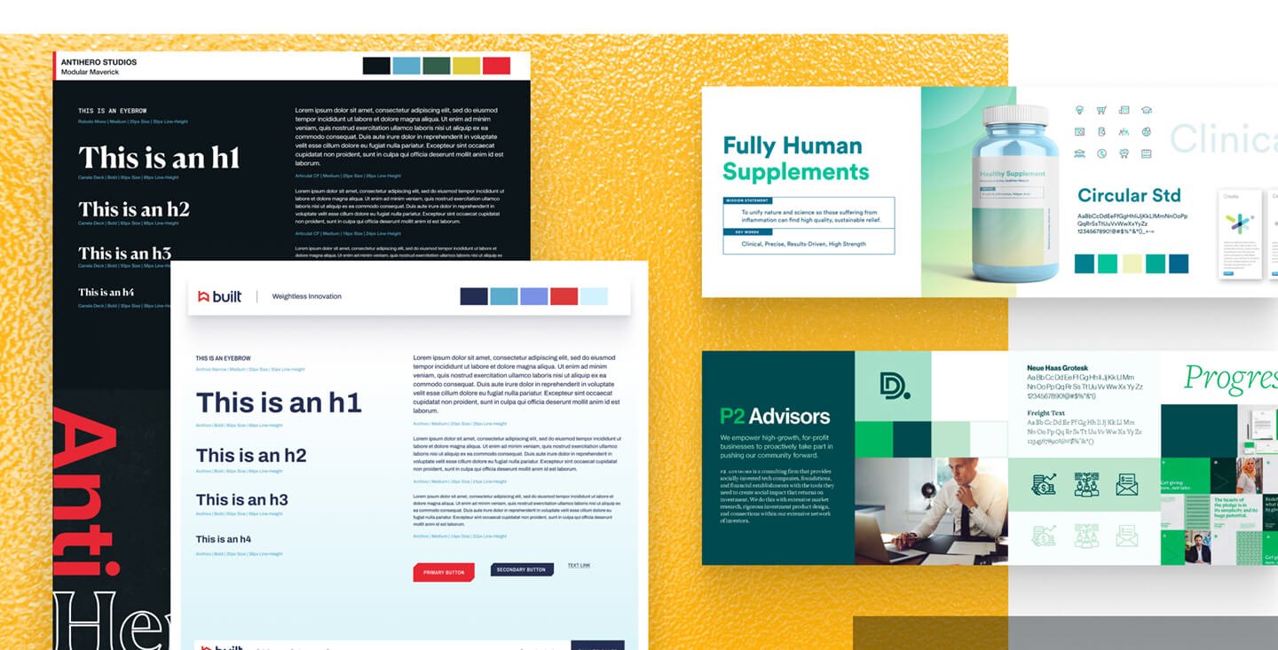
Style Tiles: Visual Strategy for a Digital Presence
Designing for anything digital can be pretty high-stakes. Not only does the visual direction need to look great, but it needs to work within UI and UX best practices. It’s no surprise how, in the past, clients would push for getting full page mockups instead of moodboards. From there, it would be a coin-toss as to whether those would lead to the next steps of approval, or rabbit-hole conversations around how a home hero banner should look—effectively sabotaging project scope and budget for everybody.
Think of style tiles as the sweet spot between moodboards and full mockups. They include real brand elements—type treatments, color palettes, button styles, iconography—designed in a layout that feels intentional, but not overly rigid. It provides a cohesive look-and-feel without committing to final layouts.
Why they work:
Provide clearer and more focused visual language than moodboards
Show how elements interact (fonts, colors, UI patterns)
Allow for faster iteration and feedback before diving into design execution
This allows clients to not have to guess what a headline in a bold serif font will look like—they can see it, next to supporting copy, buttons, or photography styles. It’s easier to agree (or disagree) with direction before the design gets too far along.

Stylescapes: Wide-Format Brand Storytelling
If style tiles are the nuts and bolts, stylescapes are the big-picture narrative. They’re more immersive and storytelling-driven than moodboards, but more structured and strategic than a vibe collage.
When done right, stylescapes fulfill the overall brand strategy and bring it full-circle. They combine curated imagery, brand elements, typography and color direction, and even messaging snippets into a linear, often horizontal composition. The goal? To sell vision, not just aesthetics.
Why they work:
They connect brand strategy with design execution
Give stakeholders a clear, compelling glimpse of the future brand
Reduce subjective feedback by anchoring visuals in context
A good stylescape doesn’t just show what the brand looks like—it hints at how it lives. Whether it's sleek and urban or organic and playful, the emotional tone is unmistakable.
The Bottom Line: Direction Over Decoration
If moodboards are about inspiration, style tiles and stylescapes are about intention. They bridge the gap between the strategy deck and the design mockup, reducing friction, saving time, and aligning teams from day one.
They don’t just help your brand’s design language look good—they make sure it works hard.
So the next time you’re kicking off a branding project, consider a more direct approach for deciding on visual language. Whether you’re presenting to a client, a marketing director, or your internal team, style tiles and stylescapes will give everyone something more valuable than just a vibe: a clear direction.