
Project Duration
July 2025–November 2025
Project Package
The Team
Creative Direction: Yadim Medore (PURE Branding)
Brand Strategy & Copywriting: Peter Littel (PURE Branding)
Account Management: Samantha Brewster (PURE Branding)
Project Management: Kim Hutt Mayhew (PURE Branding)
Design Lead: Christopher Santoro
Impact & Outcomes
Reduced creative production time by 80%
Strengthened stakeholder alignment and confidence
Expanded into an ongoing design partnership
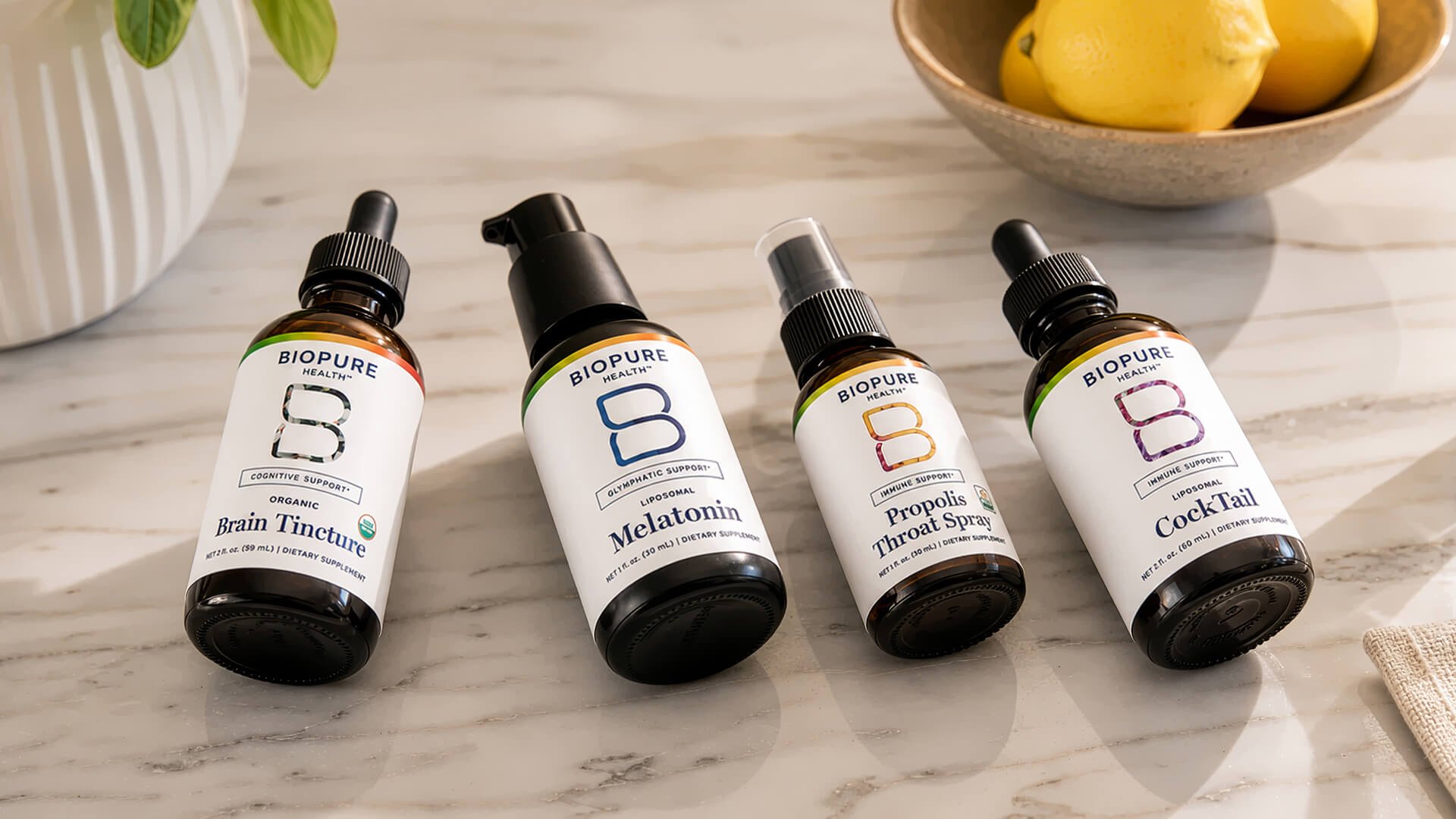
A health supplement brand focused on strengthening one’s resilience.
THE INFLECTION POINT
For more than 20 years, Biopure Health—formerly BioPure—had pioneered botanical formulations designed to support health and resilience at the root. But its inconsistent identity and packaging no longer reflected its longevity, product sophistication, or evolving mission. Following a strategy and renaming process with PURE Branding, the company needed a modern visual system built for its next stage of growth.
Where We Came In
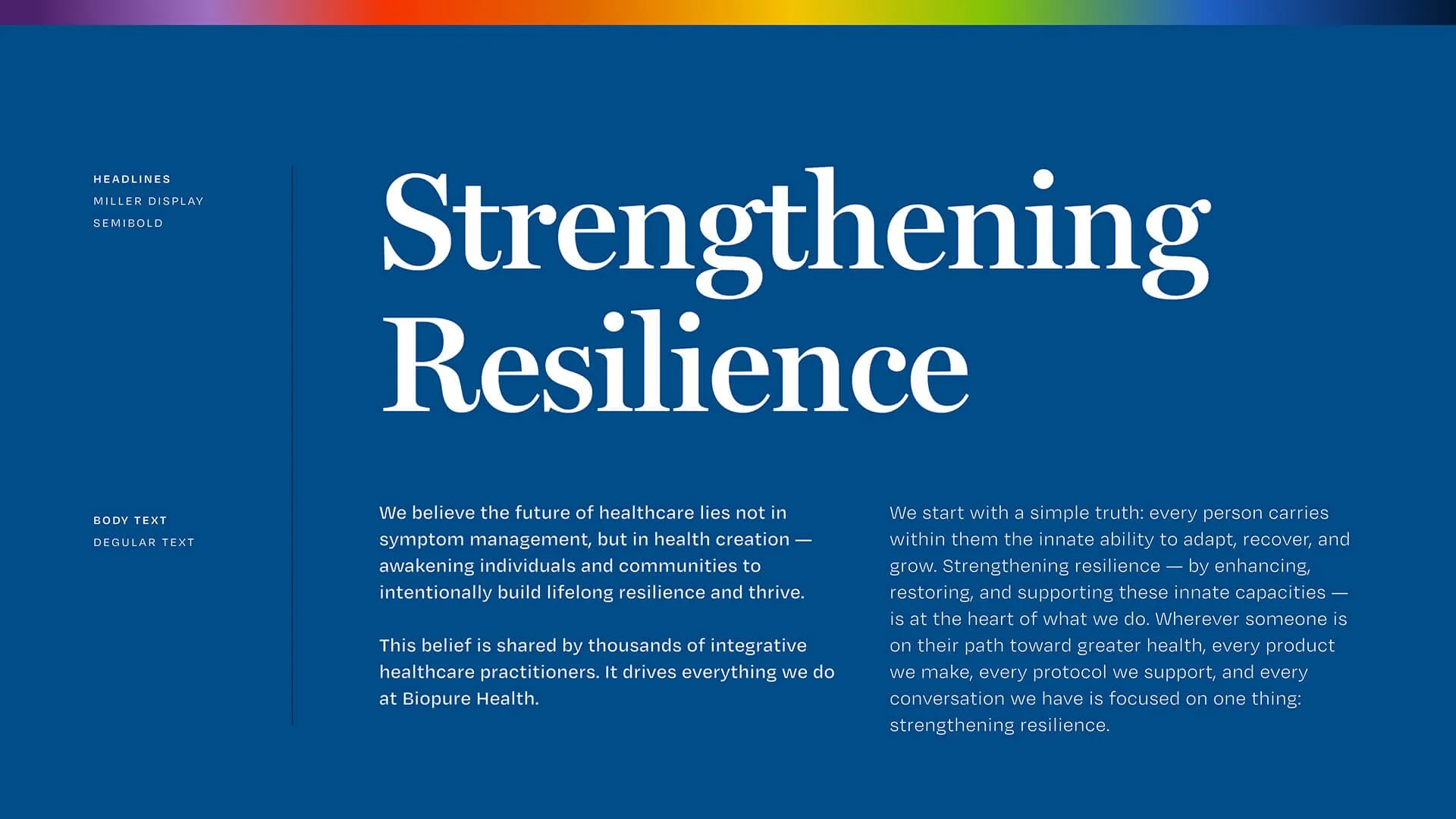
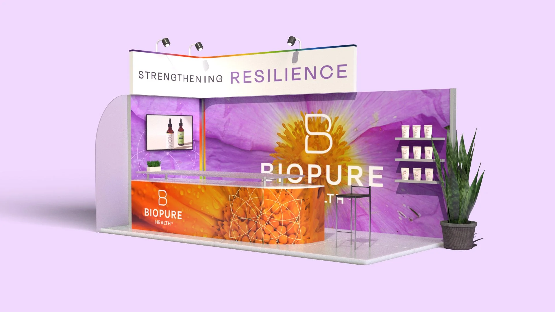
As PURE Branding’s design partner, we created a flexible identity rooted in salutogenic design principles. Sacred geometry, radiant color, and patterns inspired by nature connected the visual system to Biopure Health’s focus on resilience and whole-body well-being. We extended it across sales, email, and social templates, giving teams a faster and more consistent way to produce branded communications.

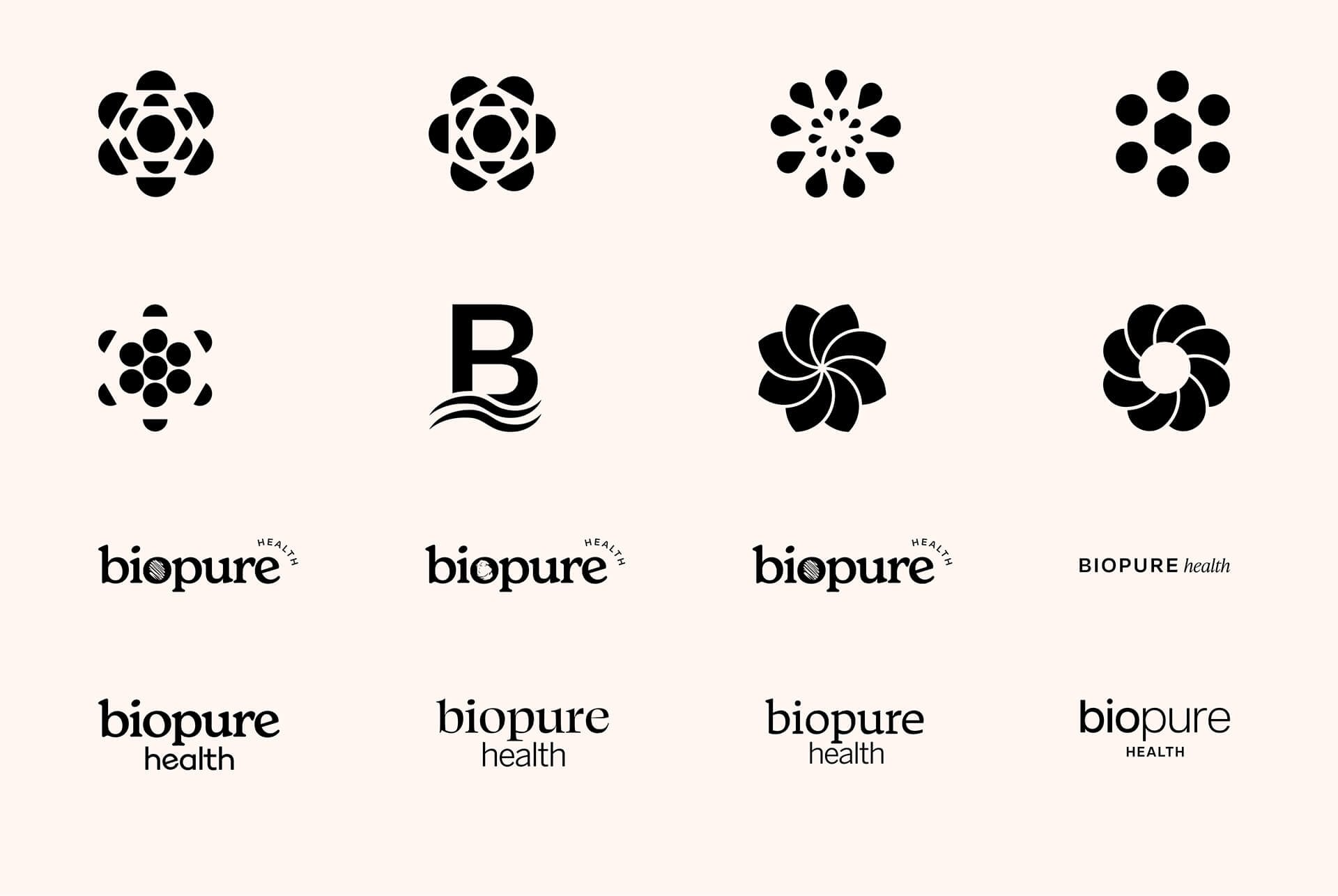

Creating meaning and purpose behind every color, symbol, and shape allowed us to give the identity system a radiant depth of narrative
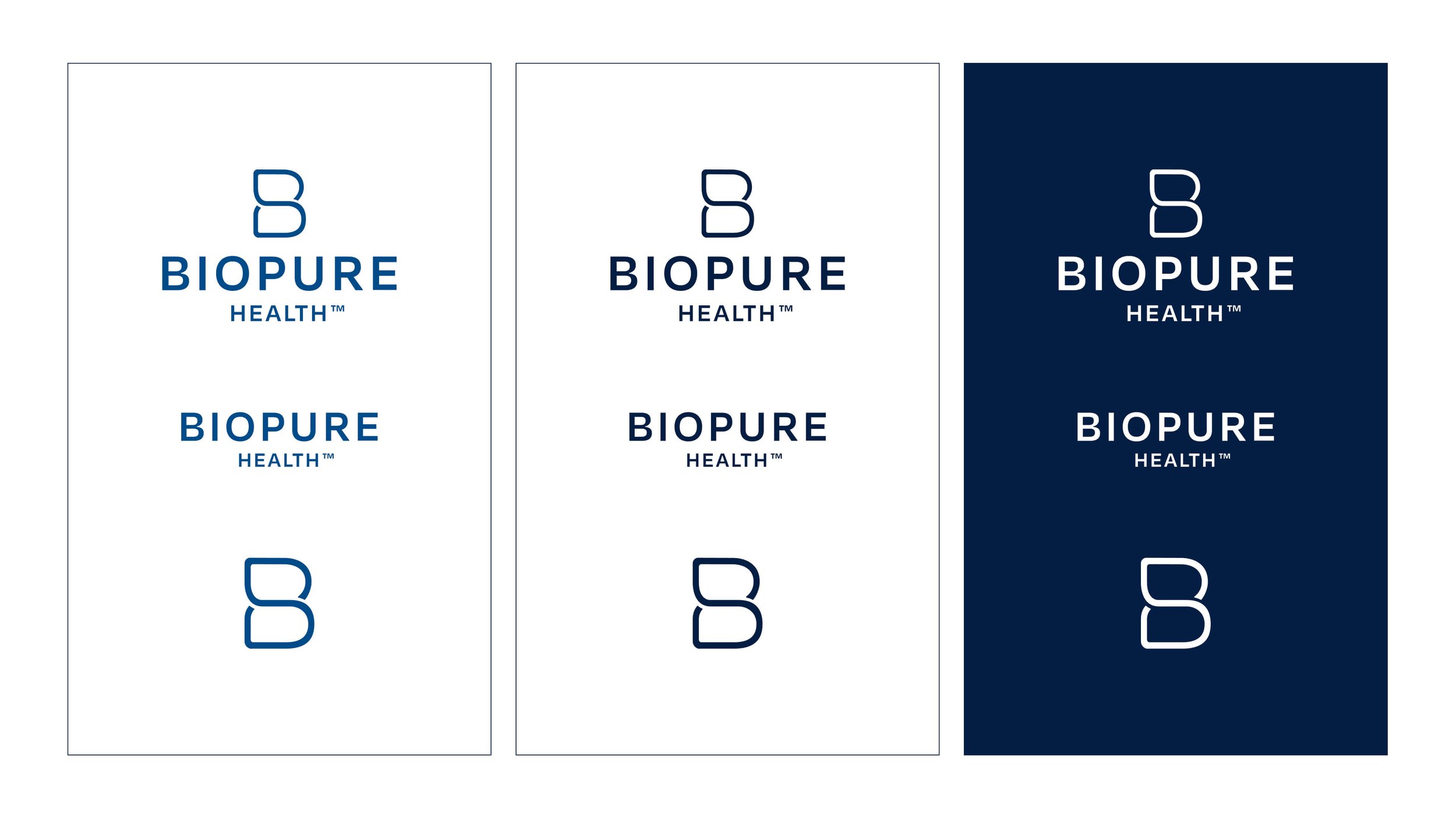
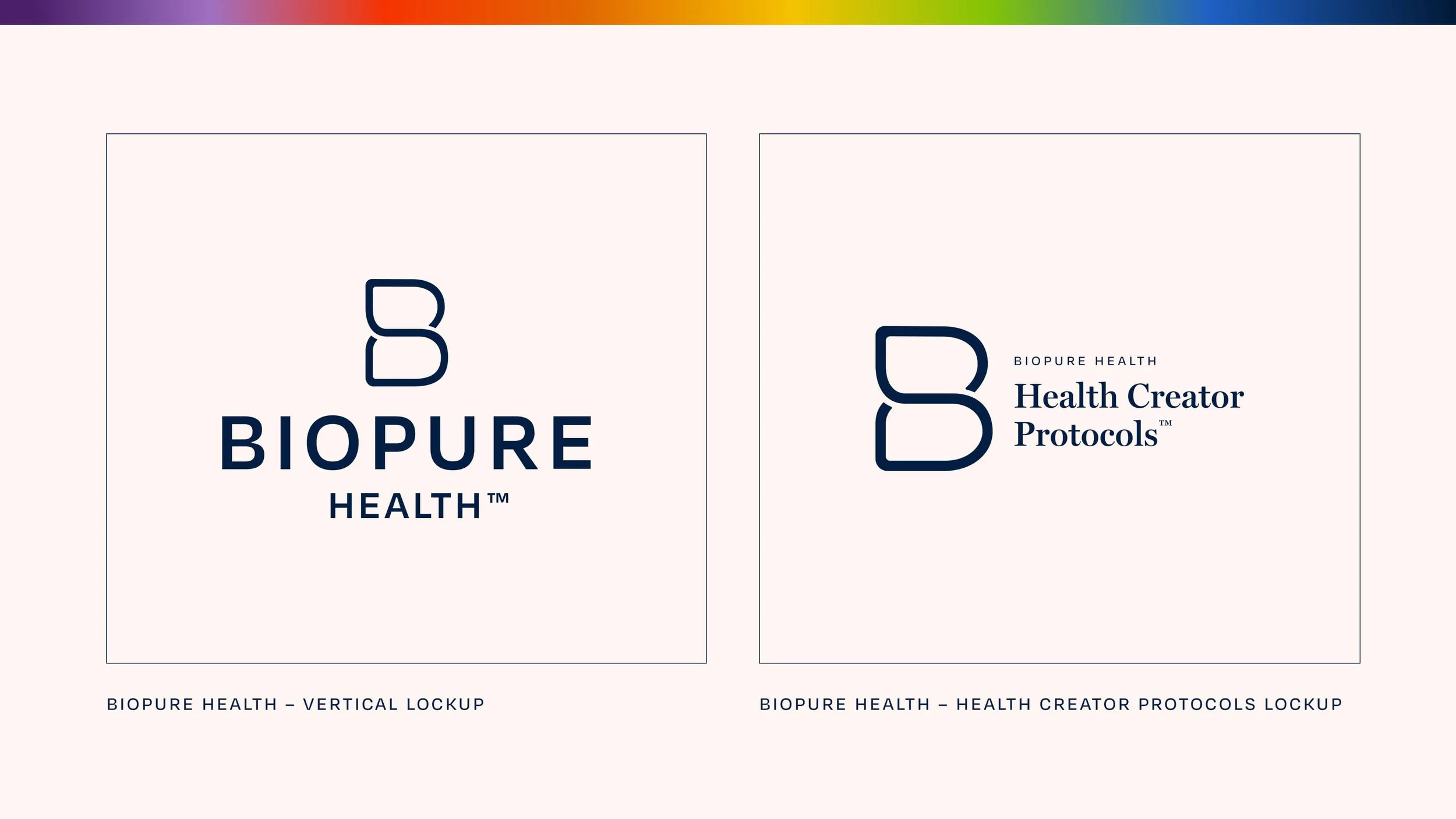

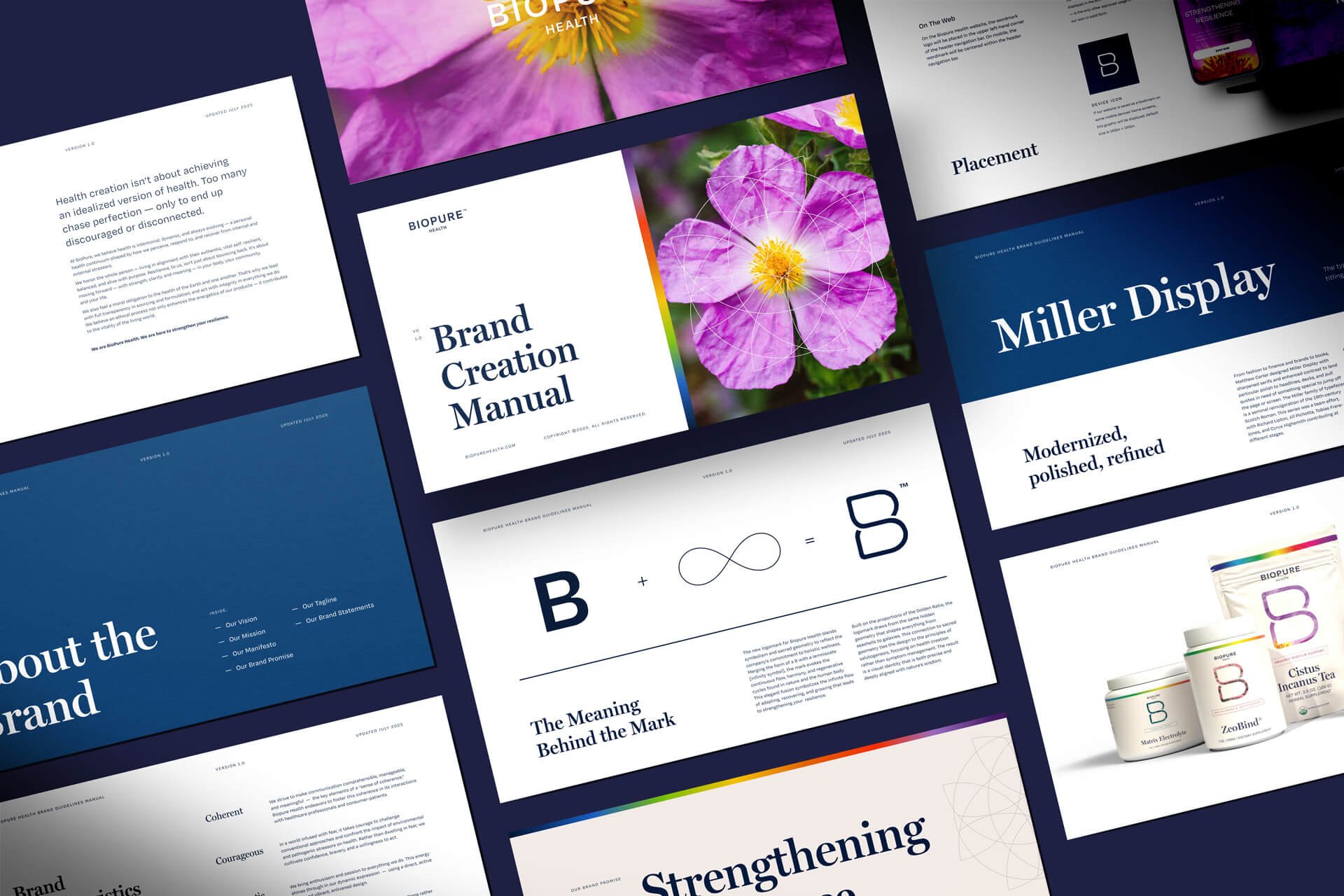
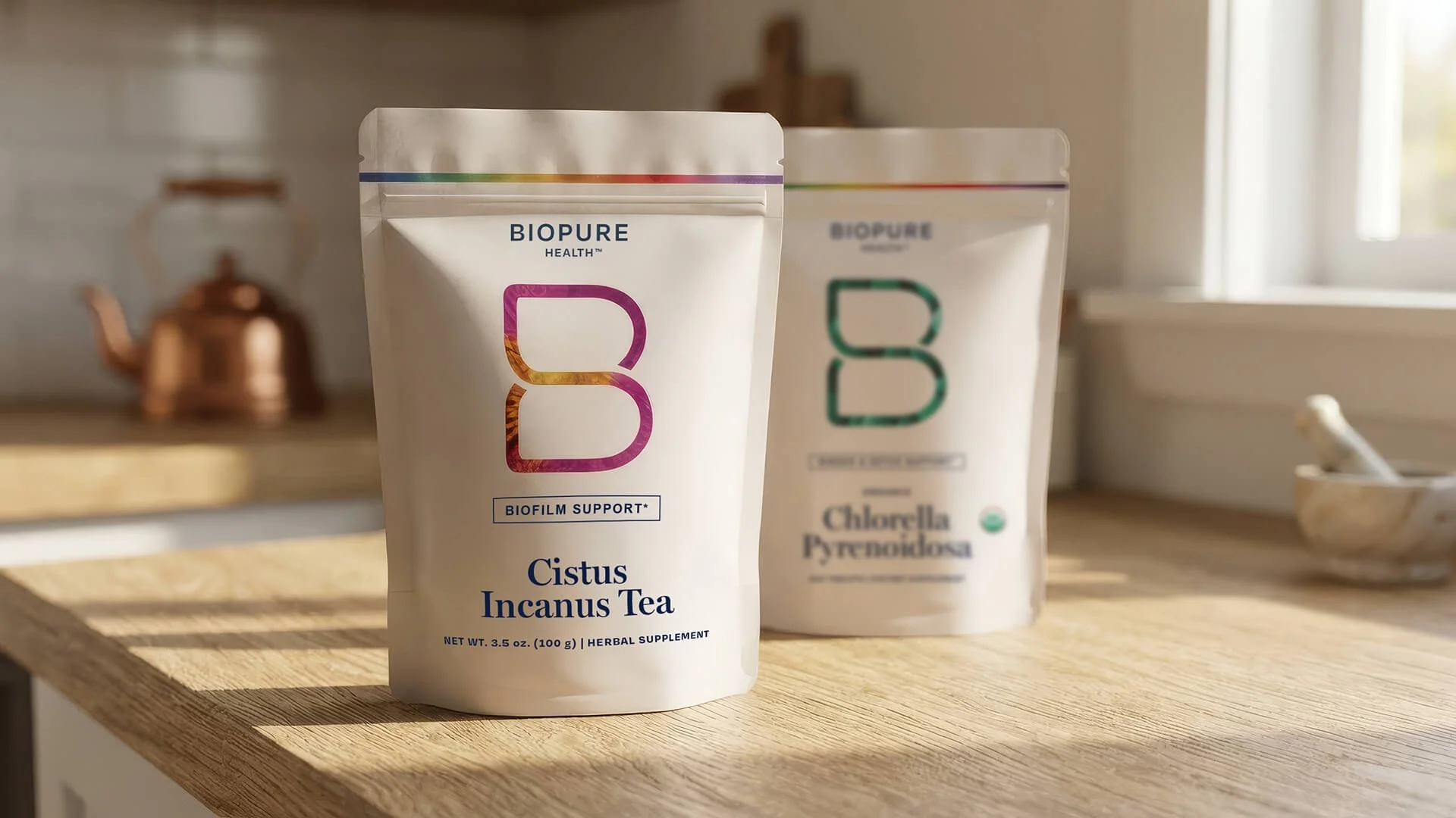
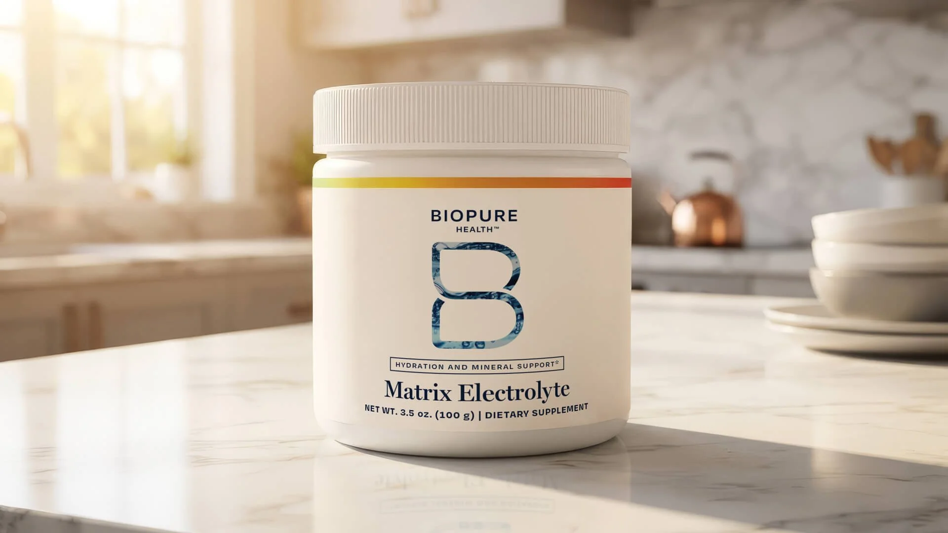
The lemniscate “B” acts as a window into the key botanical ingredient, adding a unique dynamism to an otherwise minimalist, streamlined packaging system.



By applying sacred geometry with photography, including the use of Golden Ratio in composition, the graphic language tells a story of the hidden structures within nature. These became a dynamic focal point within print and digital asset templates.




Similar Case Studies
-
![]()
My Wellness Collaborative
-
![]()
FUJIMI
-
![]()
Puff Herbals
-
![]()
Lynn Music Foundation