REALM Cannabis
Project Duration June 2025 – Present (ONGOING)
Studio Services: Branding | Website Design | Content Marketing Design | Copywriting
Special Thanks & Credits To…
REALM Cannabis Team: Austin Huck (Lead Content Creator), Zara Kalisky-Tetreault (Merchandising Specialist) James Irons (Illustrator), Gene Ray, Kyle Vigeant
Illustrations done by James Irons Illustration
Project Information
Background
Realm Cannabis, launched in 2022 as the flagship brand under Massachusetts-based dispensary Garden Remedies, reshapes how cannabis is appreciated by focusing on flavor rather than the traditional sativa, indica, or hybrid classifications. Each flower is uniquely grown to craft distinct flavors that invite consumers to explore varied "realms" of taste, offering a fresh and immersive experience rooted in the richness of cannabis flavor profiles.
The Challenge
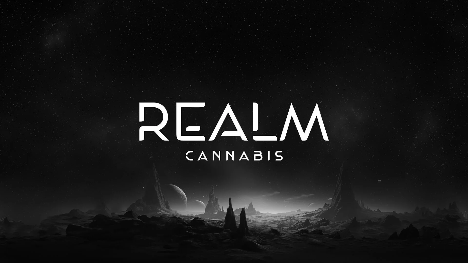
Since its inception, Realm Cannabis saw extensive growth across flavors and following. From a narrative standpoint, they took on a space travel theme which leveraged highly-detailed, AI-generated imagery of planet “realms,” with distinctive traits related to their flavor profiles. However, with only a boot-strapped custom wordmark and distinct fonts, Realm lacked a strong enough brand identity that allowed it to truly stand out amongst other competitors.
With that in mind, they needed a flexible brand identity system that not only made their brand a more premium contender in the market, but also unified their sub-brands and realms within a clear brand architecture.
Our Solution
We engaged the team at Garden Remedies to completely revamp the REALM Cannabis brand identity system and brand strategy. With renewed messaging and art direction, we proceeded with creating a library of expressive graphic assets and reusable templates for a consistent image that always stays fresh and dynamic. This leveraged itself into a suite of new packaging templates, web presence, and social graphics.
Brand Strategy
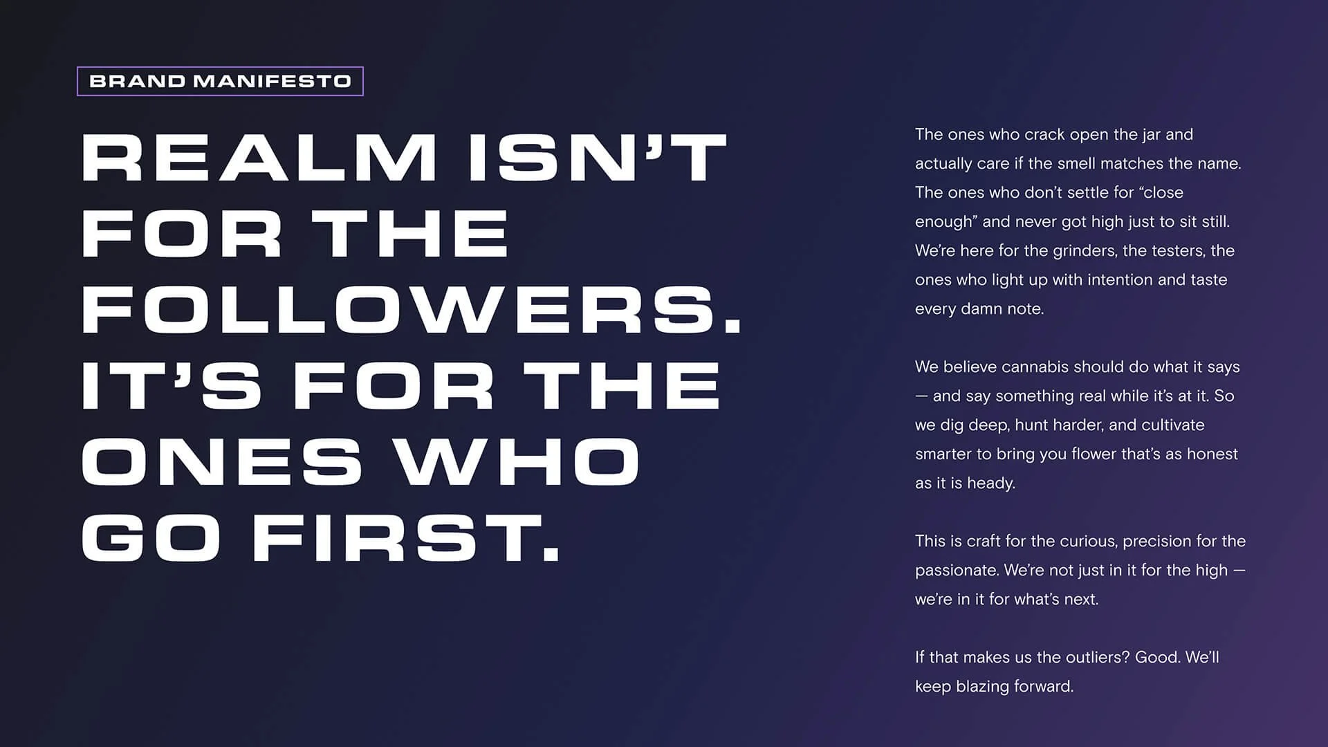
At the core of the brand, Realm Cannabis was about opening minds and perspectives. From our first Brand Discovery workshops, the stakeholders on the Realm Cannabis team made it clear that they aim to bring novices and the experts together through cannabis experiences enjoyed by anyone. No inside-baseball, just unparalleled flavor for the right set and setting. It’s ultimately where the whole “Realm” metaphor came from, and how they wanted to compel consumers to explore new ones. It was on us to help the team bring these two audiences together in a way that would excite and immerse them in our mission.
From that point on, it was about strong positioning and language. Not only did we tailor the brand messaging frameworks with forward-thinking, trailblazing, and guidance-driven attributes that define the company, but we rooted the brand within a commitment to craft and a fearless curiosity. Whereas the original branding called people to “Explore New Realms,” the time had come to center the narrative around their journeys, calling them to join the hunt.


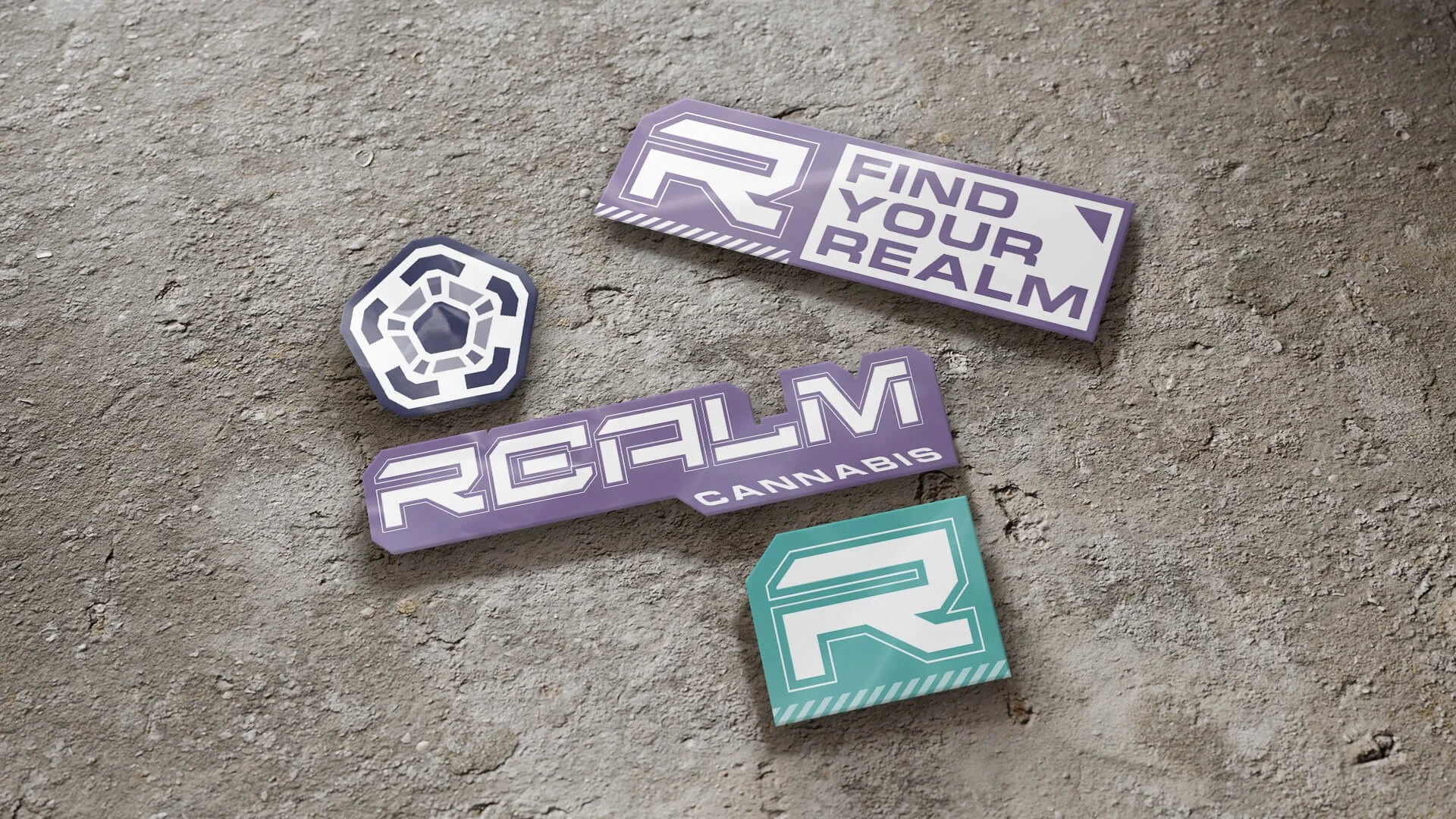
Brand Identity
While the original Realm Cannabis branding was fairly minimal, the lack of strong narrative and graphic language resulted in a heavy reliance on generated-AI imagery. What otherwise fit the general “space” theme ended up being limiting in execution. With a renewed and refreshed brand narrative, we were challenged with elevating the brand without completely redoing it. This had us leaning into a more vibrant and dynamic “cyber-punk” direction—driven by bold, powerful colors, edgy and sharp angles, and an immersive character illustration style.
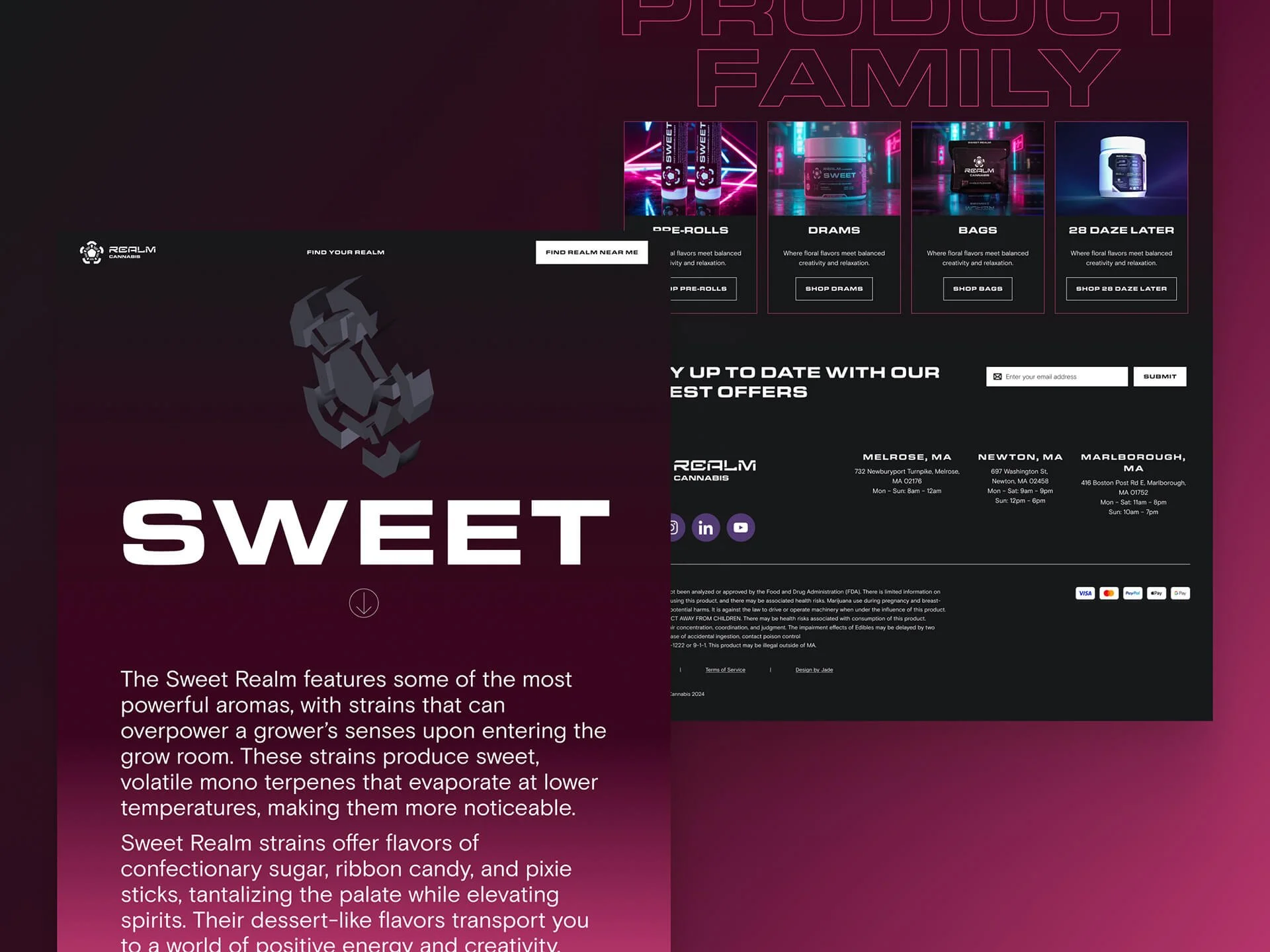
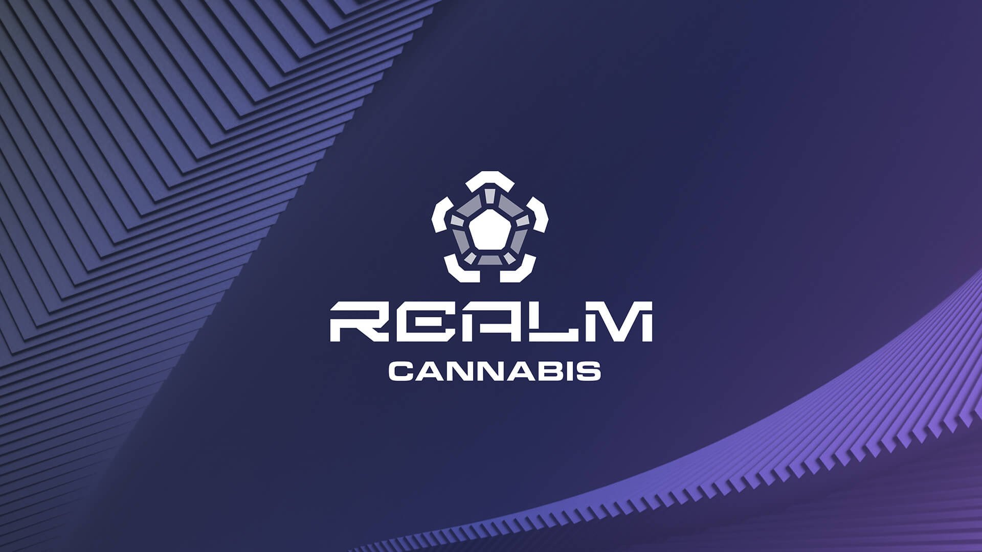
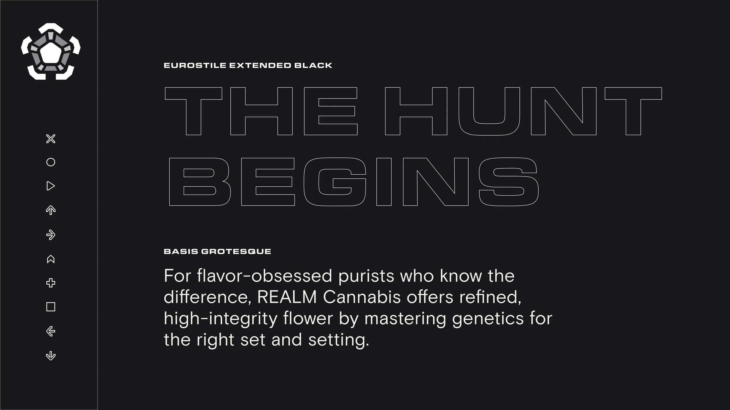
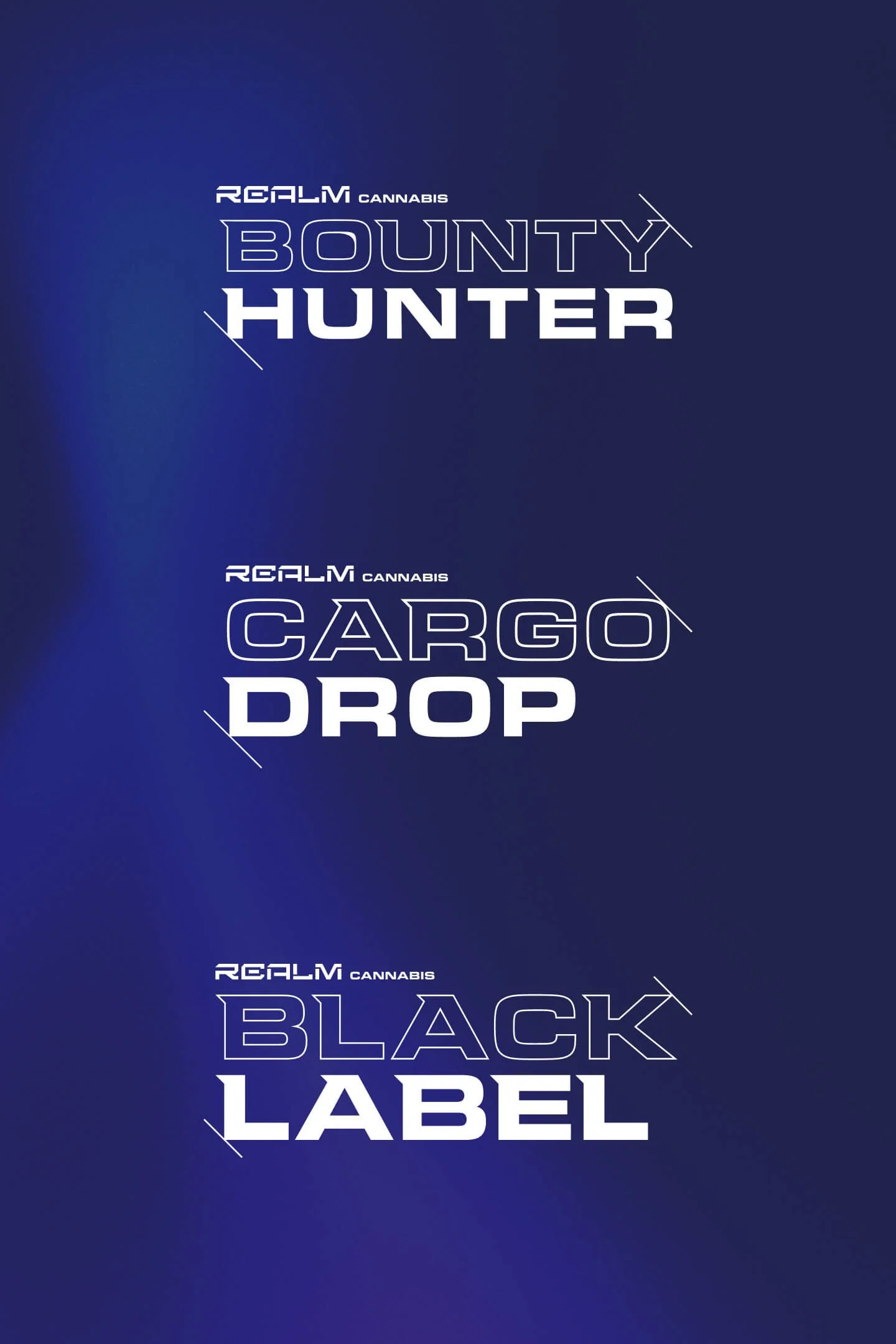
The new REALM Cannabis logomark system is based on a custom pentagonal mark, with five distinct realms converging into the center in harmony. The new wordmark paired a newly customized “REALM” with the new brand typeface, Eurostile Extended. A refreshed corporate palette of dark purples and blues not only paired well with the original black and white, but also with the base colors of each realm. Finally, deeper explorations of composition led us to create a system of frames and shapes that were flexibly used for packaging, social graphics and retail displays.
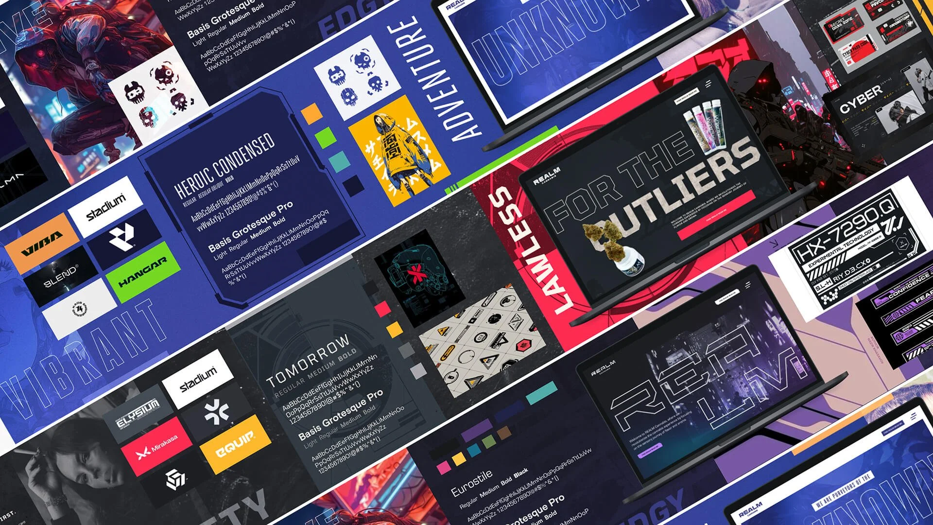
This had us leaning into a more vibrant and dynamic “cyber-punk” direction—driven by bold, powerful colors, edgy and sharp angles, and an immersive character illustration style.


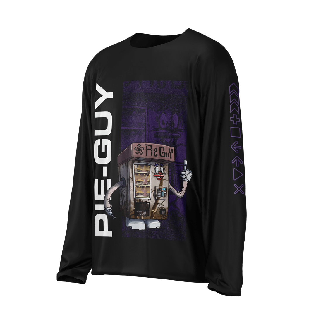
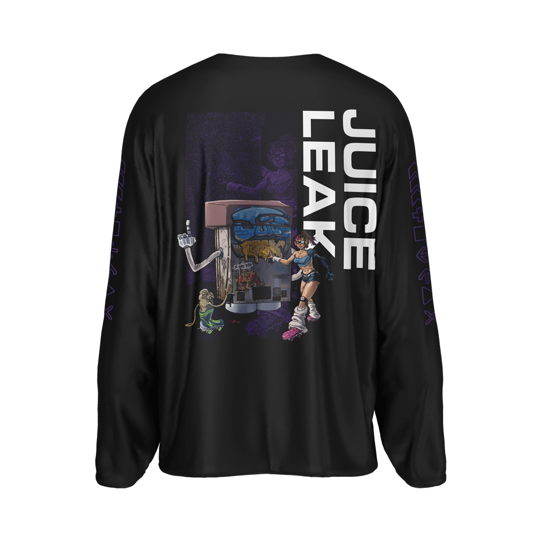
Brand Illustrations
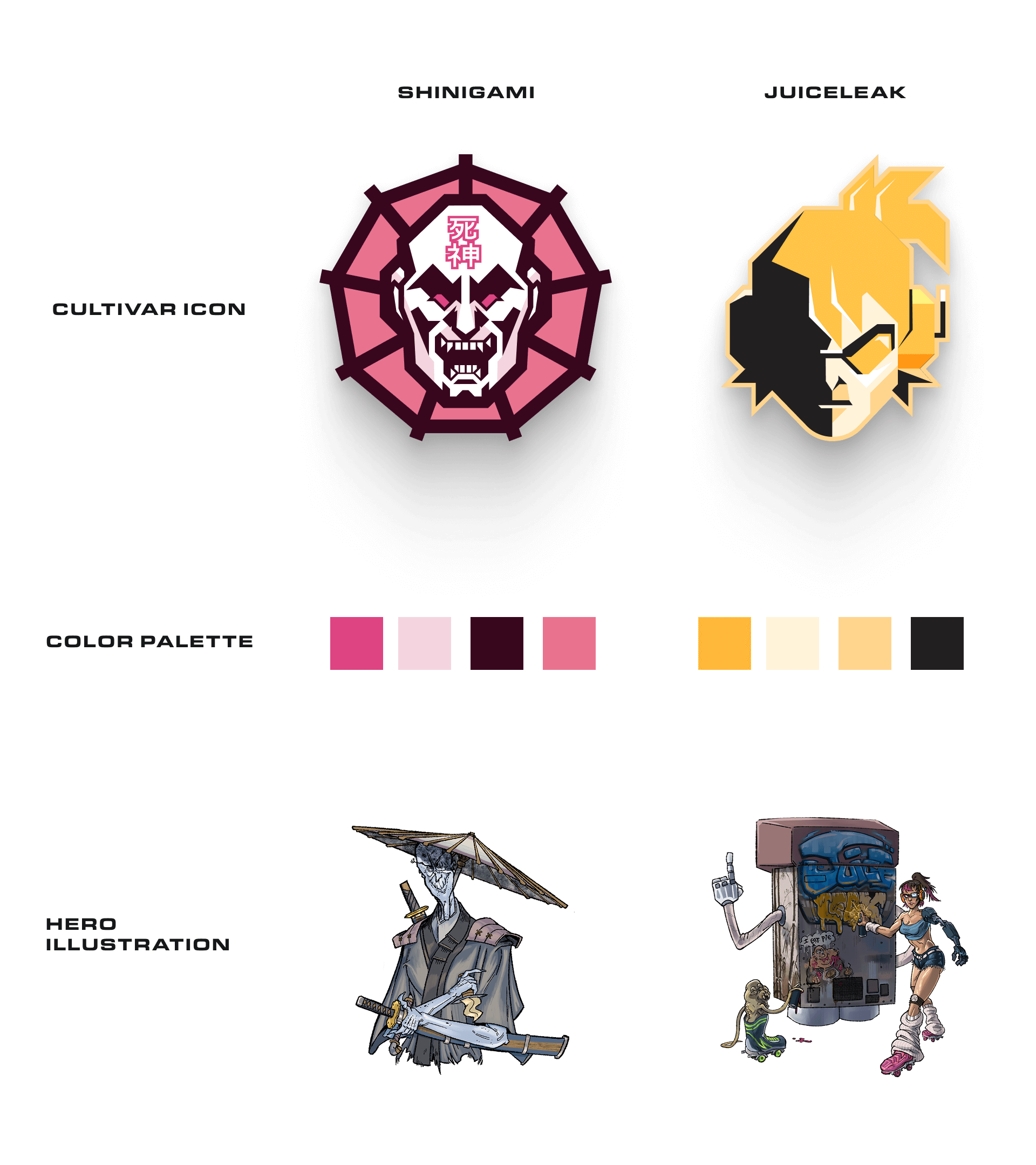
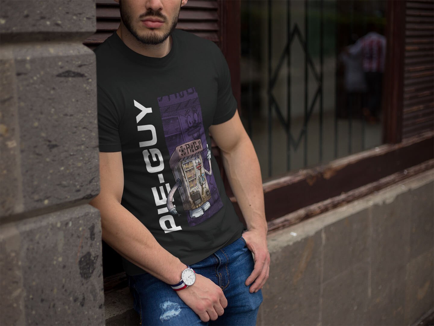
REALM Cannabis was founded on their expertly hand-crafted cultivars, selectively bred and grown to immerse people in their unique depths of flavor. With their quirky and eccentric names came equally-paired illustrations, done by illustrator James Irons. As these were a widely-favored part of the previous brand by consumers, based on insights from Wholesale, we sought to find opportunities to merge these together.
For each cultivar, we decided there would be a “hero” style illustration and a more “graphic” symbol/icon for them. This opened the doors to more unique apparel designs, as well as treatments for compliant in-store and social promos.
(MORE IN DEVELOPMENT, WILL CONTINUE TO BE UPDATED).
Packaging Design
With a newly realized brand identity system, we set out to create new packaging systems for all of their flagship products. Since the original packaging heavily relied on generated AI artwork, we wanted to make the packaging both visually stimulating and functional, allowing the shopper to know what realm they were getting from the jump. Additionally, we wanted to make the in-house production process smoother.
Taking the base realm colors, we expanded their color palettes with a series of tints and shades to add more flexibility with compositional use, while also attributing a unique gradient for each realm. These palette systems were then seamlessly applied to new labeling systems and bags.


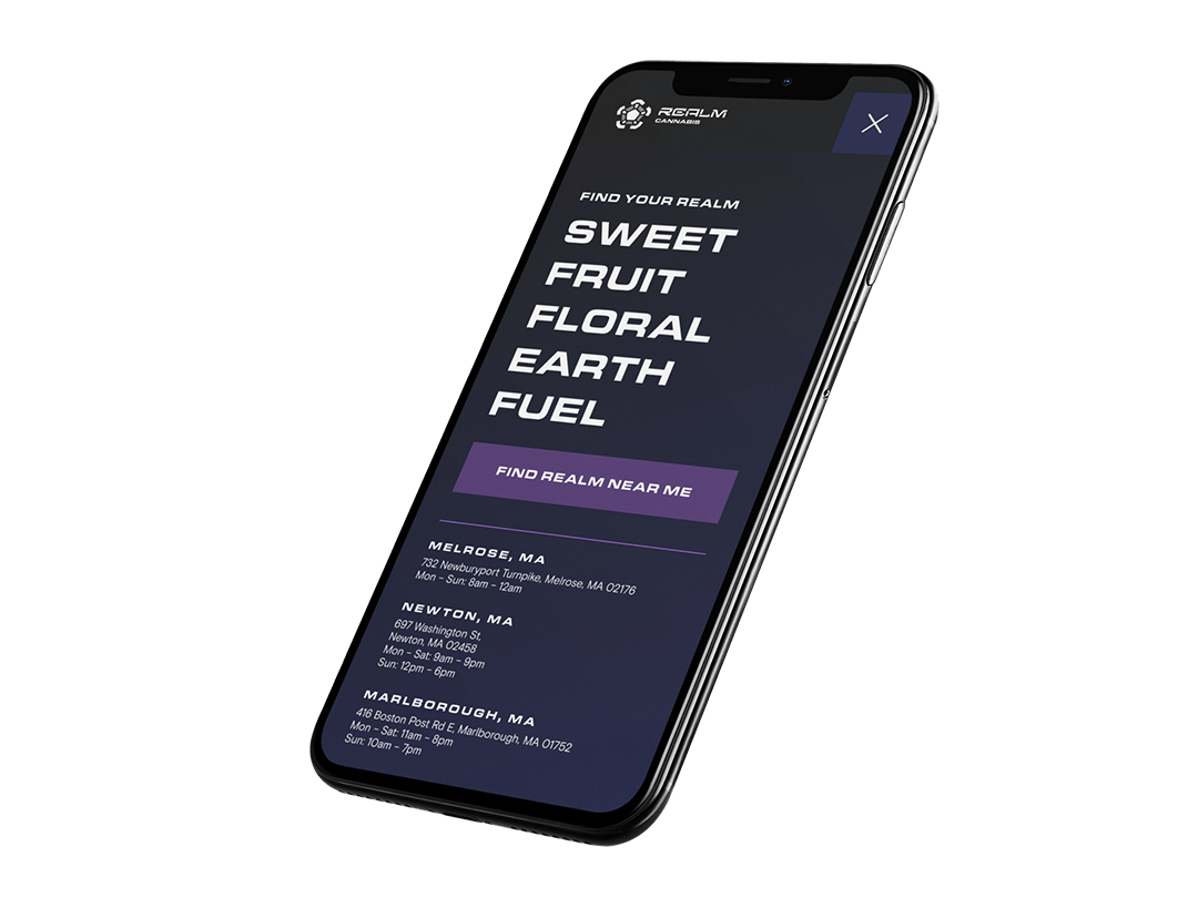
Interactive
The dynamic nature of the identity system needed to translate well to the website experience. With the original website being built on WordPress, the REALM Cannabis team needed something that was still visually immersive but easier to update and manage on the back-end. Additionally, the functionality needed to reflect the original site’s: showcase the brand, inform visitors about each realm’s cultivars and flavor profiles, and direct them to where they can buy REALM products from various partners. Because of these reasons, we decided to build the new REALM website using Squarespace Fluid Engine.
The final design brought the brand vision to life through modern and sleek editorial layouts. Dynamic interactions such as sticky-scroll sections and glowing neon hover states gave both native and custom-built components additional dimension. Pages for each realm share a streamlined template with additional 3D, on-scroll interactivity.