
The year was 2011, during my senior year of design school at Massachusetts College of Art & Design. I was in the studio, lounging on the couch with my classmates, with the new iPhone 4 I’d just gotten. Up until that moment, everyone was talking about or using this new social media platform that was just photos. More than that, you could apply filters that made it feel more modern or vintage (college millennials loved vintage stuff back then). It was called Instagram, and I wanted in on it. I downloaded it, and took the first of what would be hundreds of posts, over the span of a decade and a half.
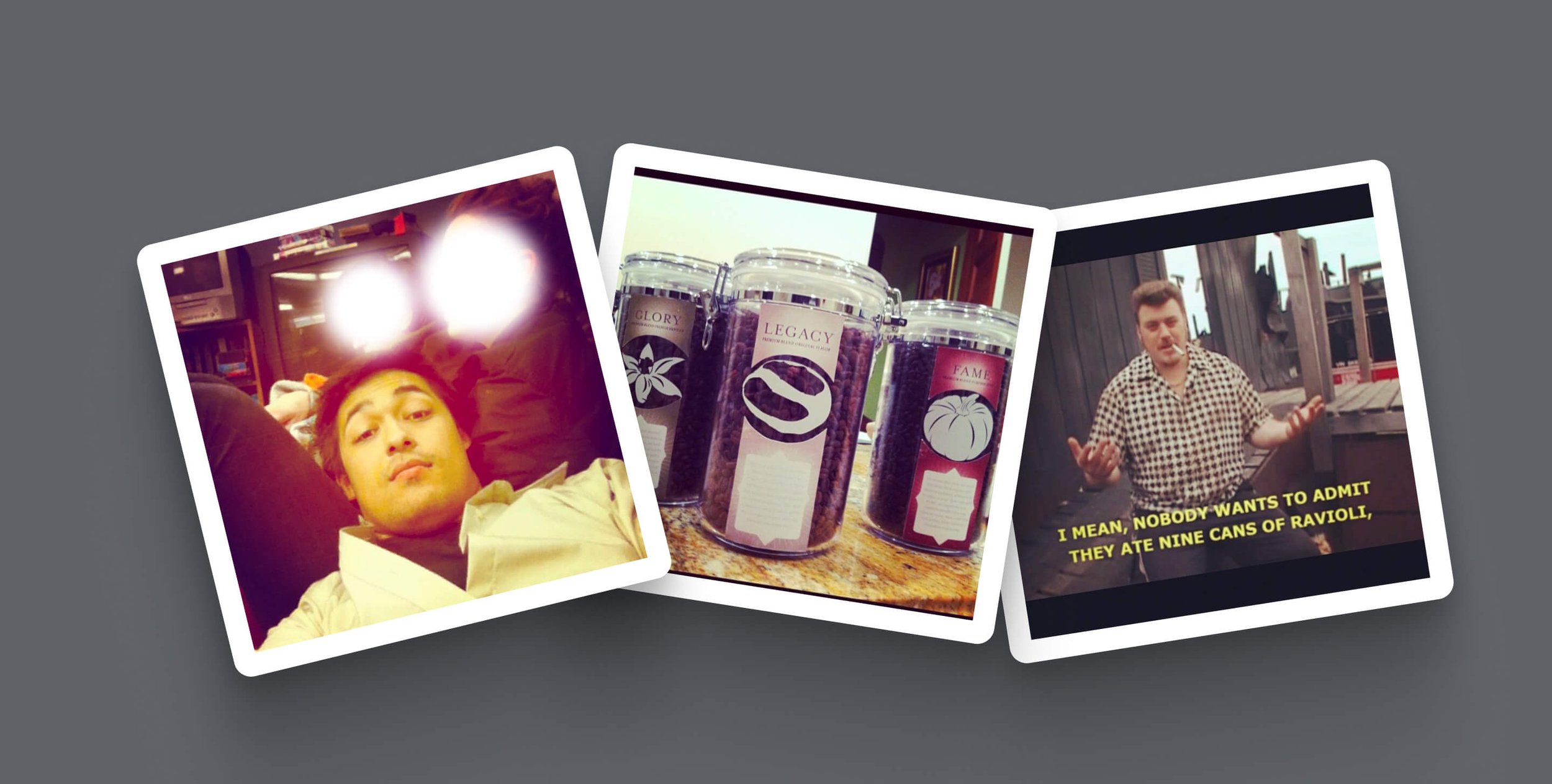
Oh, to be young and carefree again. Also, Trailer Park Boys 🥹
It was a simpler time then, but from that point onward, everything changed. After Instagram was acquired by Facebook (Meta) in 2012, Instagram went from being a photo-sharing social platform to a pivotal cultural medium. When brands started using the platform to connect deeper with their audiences, Instagram added paid advertising and boosted posts. When TikTok gained popularity during the pandemic, Instagram introduced Reels to compete. Finally, when AI entered the mainstream post-pandemic, Instagram started adding AI features to its chat and search functionality.
Fast forward to 2026, and Instagram has just released its newest update: a complete rebrand.
It’s only been a couple of days since they unveiled it, and the internet has exploded with comments split down the middle. Our thoughts? Well, keep reading, friend.
A brief look in time…
When most people think about Instagram, they can’t help but remember the retro-inspired, skeuomorphic polaroid camera icon they started with in 2010. It was super charming, friendly and expressive. It was also paired with a quirky, semi-cursive wordmark done by the co-founder, Kevin Systrom.
Over the years, as skeuomorphism was eventually replaced by more flat design, the iconic camera icon was replaced with a streamlined, geometric icon with a bright, warm gradient in 2016, followed by a new wordmark done by globally-reknown designer and typographer, Mackey Saturday. Inspired by the Billabong typeface, the wordmark was a refinement of the original cursive.
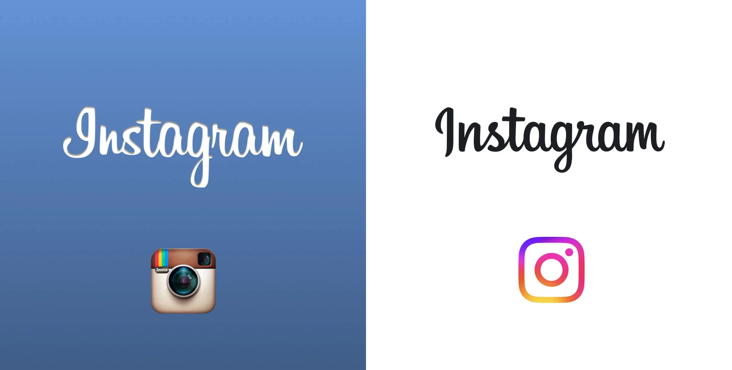
The original 2010 launch brand (left) to the 2016 refresh (right)
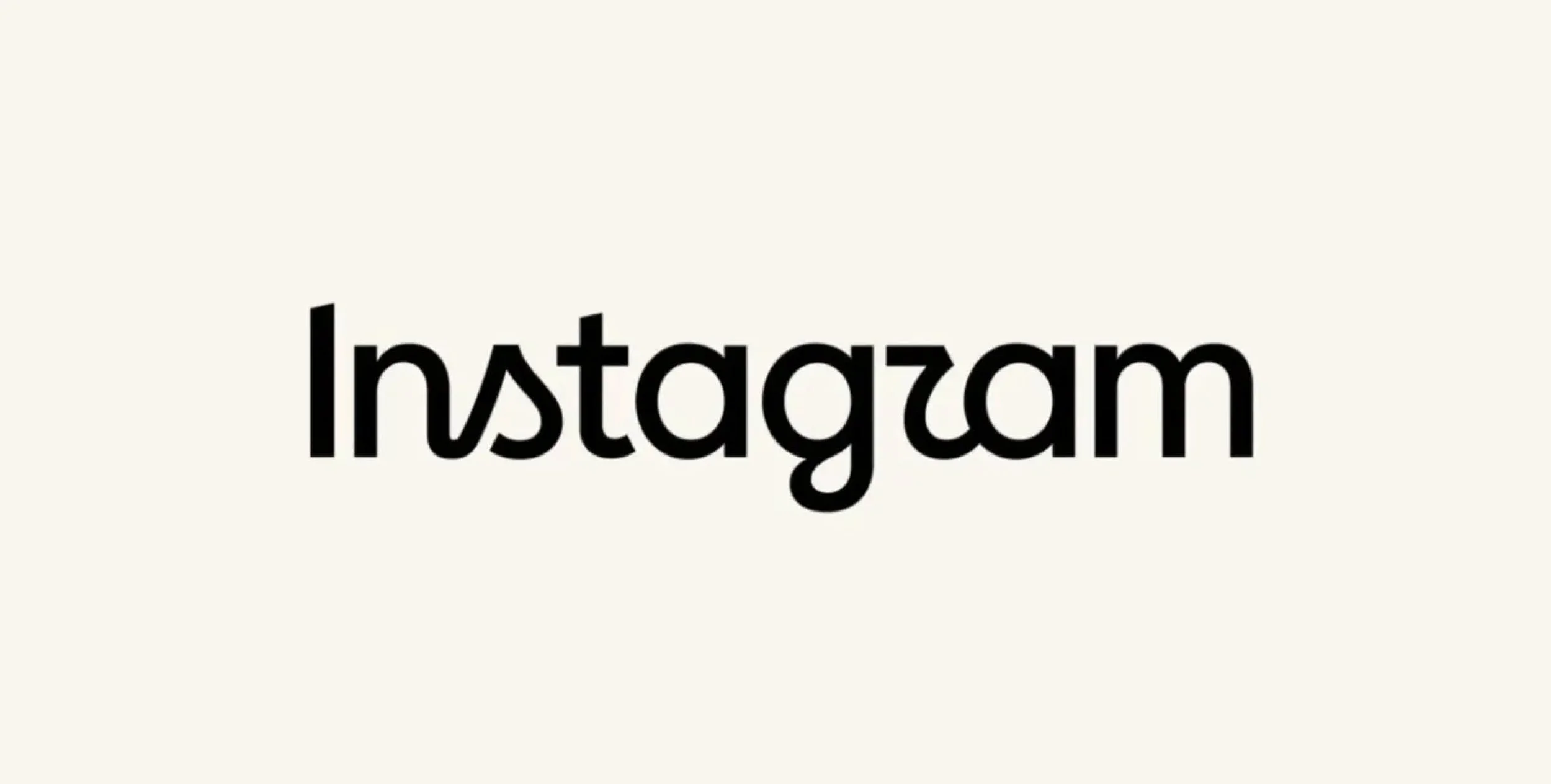
Today, led by Meta Creative Director, Christy Silva, and Director of Brand Design, Cynthia Pratomo, the Instagram brand identity has taken on a more stripped-down and neutral visual language. The wordmark has now evolved into a geometric style with echoes of its cursive past, now seen locked up with the actual icon. While the gradient background still remains on the iOS icon, color takes a backseat within the rest of the visual language across advertisements and other materials, giving more prominence to the photography itself. Other smaller refinements to Instagram’s typeface, Instagram Sans, were made for legibility purposes.
In an interview with It’s Nice That, Cynthia Pratomo described the new identity system as a coming of age when she said, “…Growing up means acknowledging there are more sides to Instagram now. We grapple with many different tones and messages: sometimes serious, sometimes encouraging, sometimes edgy. We needed a system that could handle all of that.” By taking on a more neutral style, Instagram takes on a more supportive role to the main stars of the show: the creators themselves.
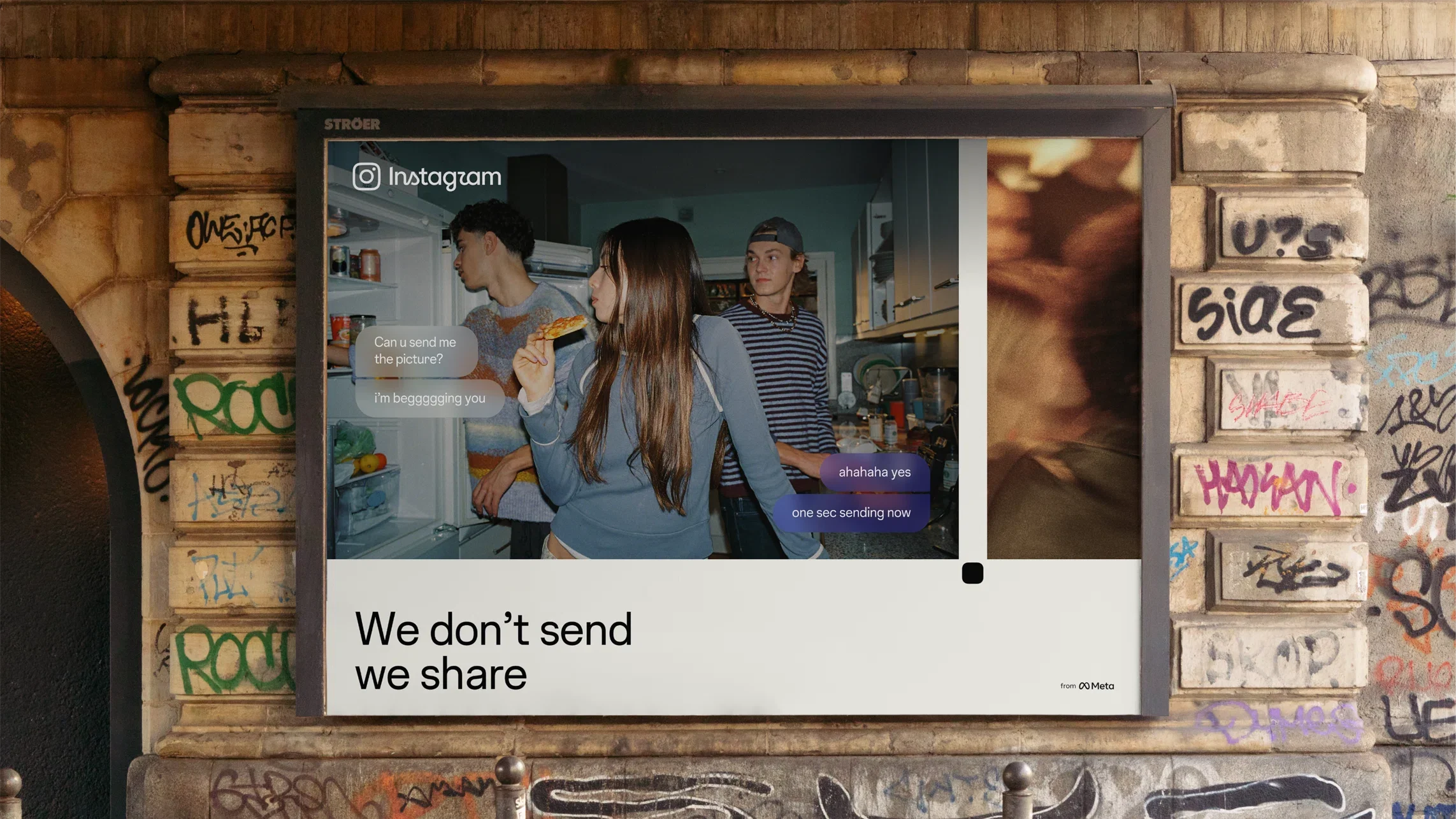
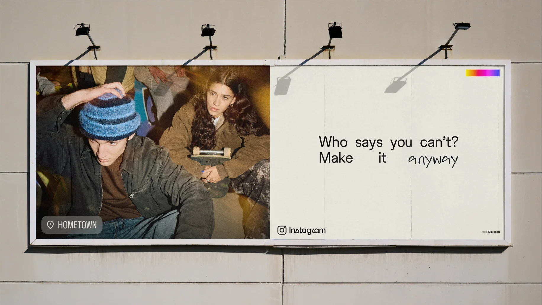

ABOVE: Instagram: Copyright © Meta, 2026
Where it succeeds
The intent or “big idea” behind the rebrand itself is a success. From a photo-sharing platform to an all-inclusive hub for content creators, the new visual language seeks to provide a blank canvas to anyone wanting to express themselves and make it their own. There’s something interestingly romantic about that notion, though it borderlines quixotic when you think about the “darker” perspectives that exist on the platform too. Marrying photography principles within the brand’s design language feels conceptually appropriate and visually interesting. One can’t deny that there is a refined compositional aspect with more negative space framing each image, as well as seeing elements like registration marks and viewfinder devices anchoring them in the concept of making.
On some level, I can even appreciate the desire to revamp the wordmark since the platform has changed so much since 2016. Objectively speaking, it does compliment the current IG icon in the lockup, and it attempts to keep some of the cursive. Cynthia Patromo, Director of Brand, said it was Instagram’s commitment to “real, unfiltered expression.”
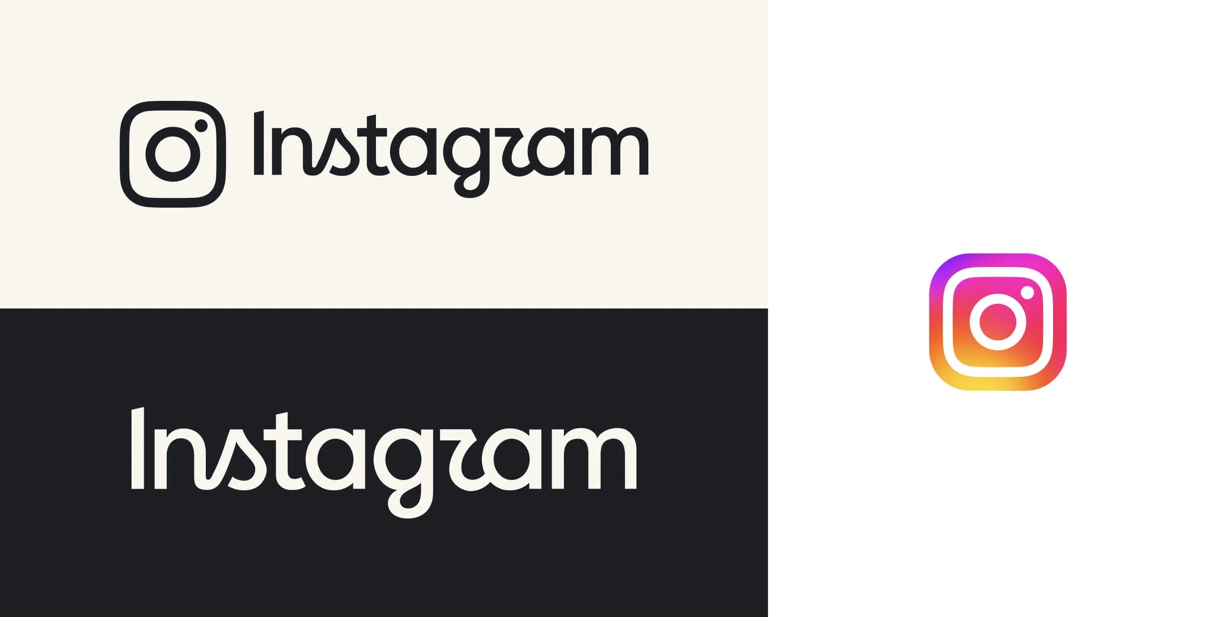
For the first time in its history, the mark and wordmark are formally locked up together as part of the new Instagram logo system.
Where it falls short
One issue I have with it is general legibility. With the more upright geometric look, the cursive “S” and “R” lose their terminals, or the little loops that help insinuate the letterform. From a brand standpoint, it makes me think they aren’t worried about them since the platform is used globally, and folks can otherwise discern the name (especially when locked up with the mark). It’s a valid counterpoint, it’s just something I wouldn’t do.
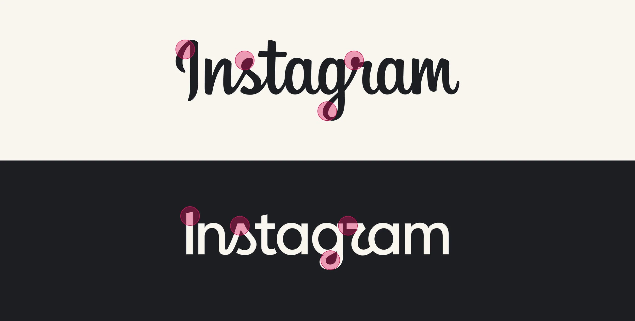
Between the 2016 wordmark (top) and new wordmark (bottom), calligraphic terminals and swashes have been replaced with hard caps and inktraps for a streamlined, geometric look
The main issue with the identity system comes from a point of irony. Their commitment to authentic expression is now represented by an overly-perfect, streamlined wordmark that, by itself, doesn’t seem to express much at all. Compared to the Mackey Saturday wordmark which had a refined sense of warmth, the new wordmark feels painfully neutral and devoid of any character. I feel like it would’ve been more than possible to fulfill the rebrand goals without touching the original wordmark, or at least redrawing it to capture the brand essence while not compromising its visual expression. For the cursive traits they kept, it unfortunately feels like a “reblanding” to me: simple, clean, but neutral to the point of sterile.
Closing Thoughts
Here at the studio, we try to view everything with an objective lens because there’s always something to learn. As far as the new Instagram brand goes, I feel like it’s down the middle. For its successes, there are some flaws that feel pretty fundamental.
Overall, I feel like the goal of the brand becoming secondary to the users’ journeys was fulfilled, and one could argue that there’s a quiet, yet emboldened confidence about it. After all, it’s a product owned by one of the biggest tech companies in the world. That recognition brings a level of confidence few companies can dream of having.
As for us, the users, whether we feel it or simply intellectualize it; that’s the question.