“Transformative Collaboration”: Lessons From The InVision Rebrand
There’s no designer out there who can’t recognize the name of InVision. Throughout my career, I’ve found myself using it for a number of projects. As a stalwart in the digital space, it has constantly evolved with the needs of its users, whether it was prototyping or moodboarding. However, over the years and with newer developments in design software, InVision’s prominence in the market was otherwise dulled—at least for a little while.
Up until the rebrand, InVision’s logotype featured the customized “vision” being connected to the “in” box.
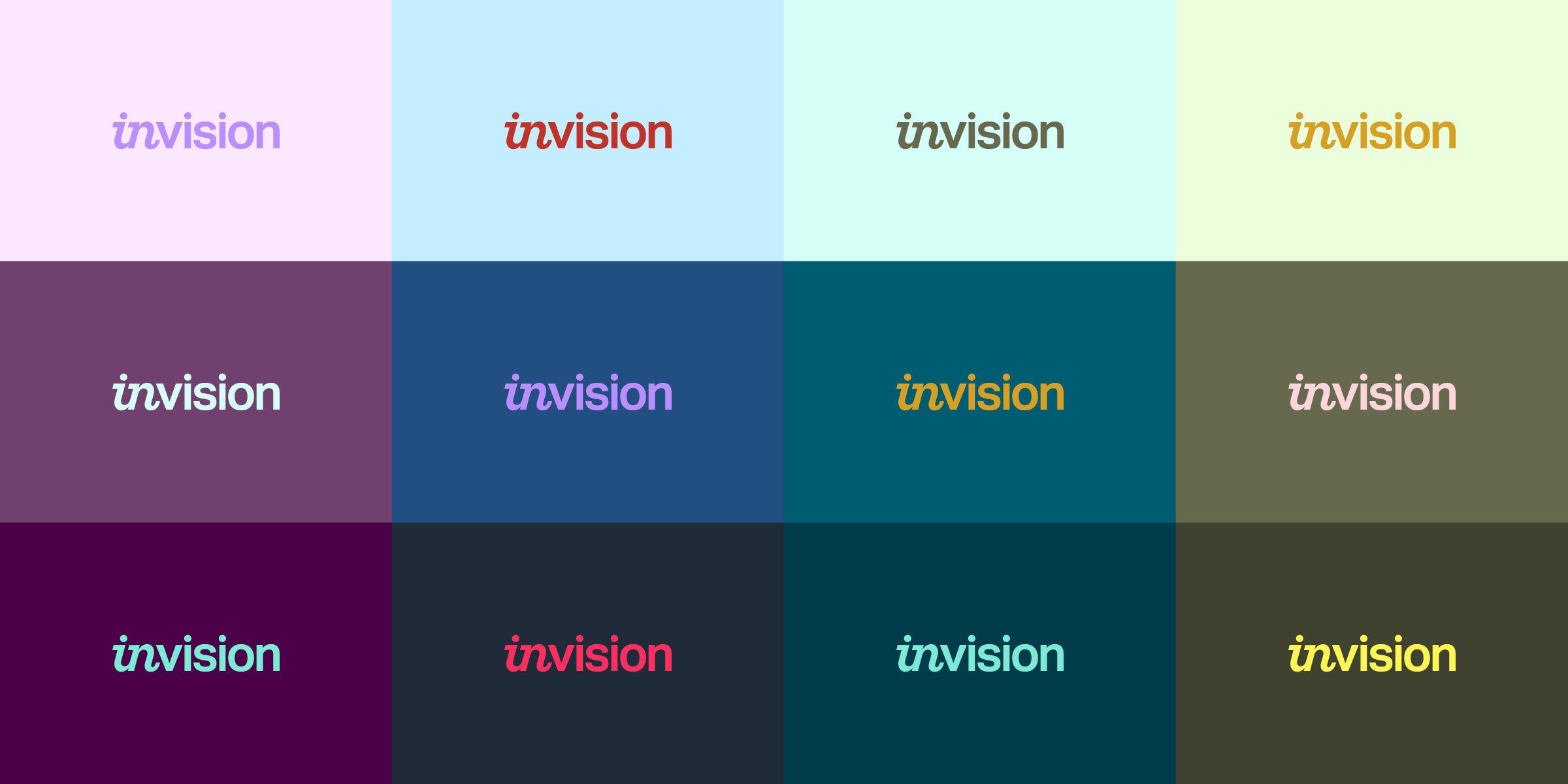
The newly refreshed logotype removes the box around “in,” bringing together what had been separated for so long. A retooled “in” creates a perfect harmony with the “v” in “vision,” ultimately resulting in a harmonious logotype that fulfills the brand mission. Image by ENSEMBLE
In 2022, with the help of the UK design agency ENSEMBLE, the digital product design platform underwent a major rebranding effort and product revamp. Empowered by the brand promise of “Transformative Collaboration,” the new rebrand launched the platform into the business of integrative digital workspaces.
Even though I’m admittedly not as big a user of InVision anymore (hello Figma!), I still admire it from afar and I especially admire them for this move. Not only was this pivotal in InVision’s brand and product evolution, but also its renewed relevance in the creative and tech industries.
Utilizing the modular square grid structure above, the InVision brand identity can create a number of different layouts that span both static and animated contexts. Image by ENSEMBLE
From Prototypes To Possibilities
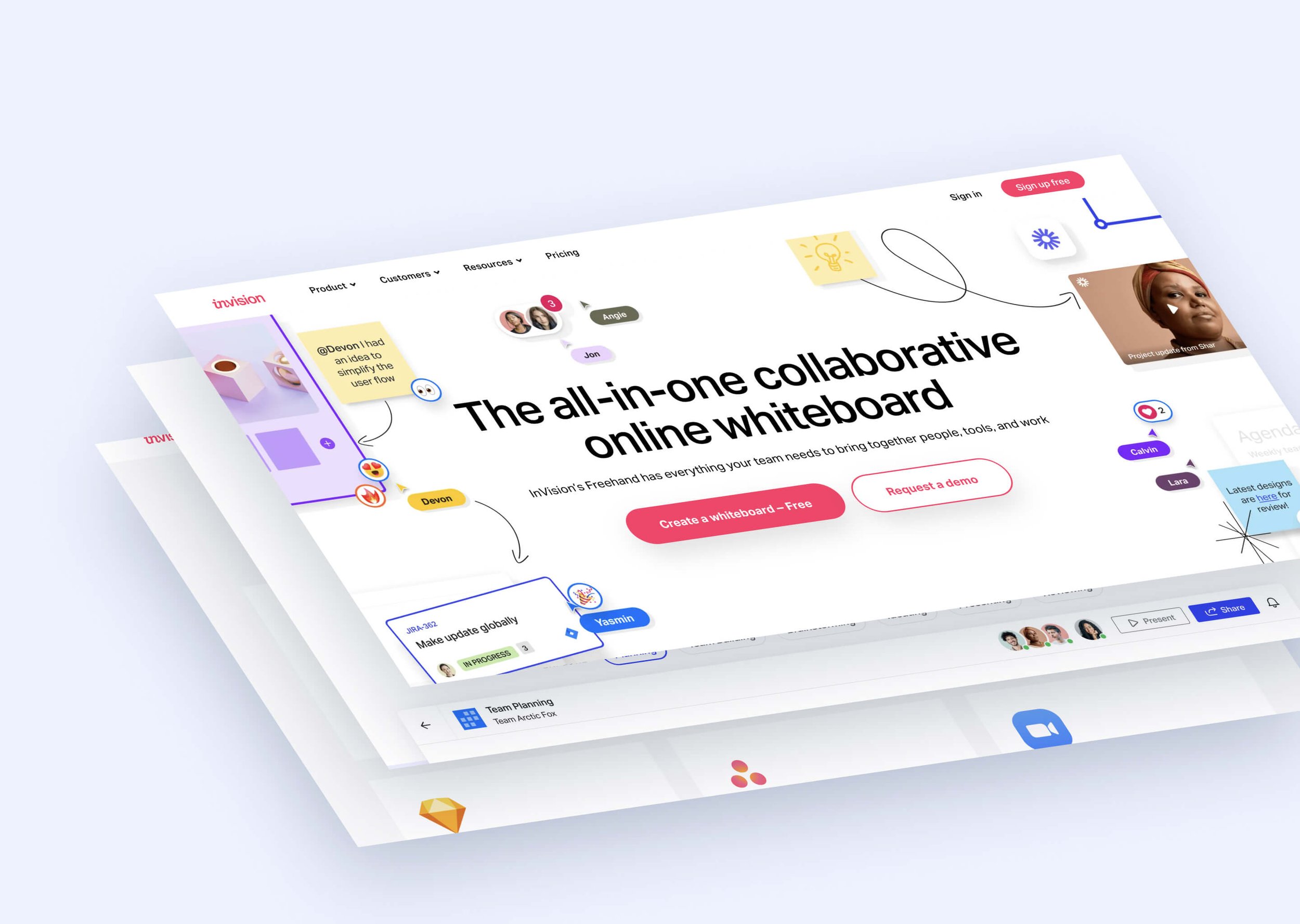
InVision had long been a platform strictly for prototyping low or hi-fidelity designs. Today, the platform has become a playground for all team members to converge and think aloud as one, as they now compete with other white-boarding platforms like Miro and FigJam. Within seconds of logging in, users are able to choose from a variety of different templates for brainstorms, sprints, workshops, and other sorts of team exercises. This results in an endless canvas of possibilities, strategies, and ways forward.
True to InVision’s new platform, the brand messaging is centered around the various integrations InVision supports. This messaging, across its various touchpoints, served to underscore InVision’s brand promise of “Transformative Collaboration.” Image by ENSEMBLE
Collaboration As A Brand Value
When it comes to working within creative or tech, the word “collaboration” is thrown around a lot—mostly because it’s important! However, for InVision’s rebranding, it served as a key pillar in its evolution. One only needs to scroll down to the next section on the homepage to figure out how their platform pulls together collaborators across disciplines; designers and non-designers like. They clearly recognize that great digital products are not created by individuals working in isolation, but rather by teams working together seamlessly. InVision's new branding reflects this emphasis on collaboration by highlighting the importance of teamwork and communication in their messaging.
The promise of “Transformative Collaboration” manifested in a platform of limitless possibilities. Image by ENSEMBLE
Change Is Good For Business
Sometimes to move forward as a business, big changes are necessary. As a designer and brand strategist there are a number of reasons that make this successful, and while I could hone in on the visual beauty, I feel compelled to highlight the business significance.
Ultimately, the decision to move away from prototyping ended up being extremely wise because they were no longer competing with other players in the market. InVision’s static JPG-driven prototyping slowly became overshadowed by the rise of in-app prototyping offered by competing platforms like Figma and Framer. Even initiatives like InVision Studio, their own spin on a UI design & prototyping platform aimed at bringing design and dev teams closer together, ended up falling flat.
Released in 2018, InVision Studio was supposed to be the UI design & prototyping platform the creative industry was waiting for. However, it never picked up the steam that competing platforms like Figma and Adobe XD already had.
Additionally, with the rise of remote working conditions due to the COVID-19 pandemic, the demand for better collaboration tools became more prominent. By pivoting their product offerings, they were able to hone in on making their whiteboard app strong enough to both fill a growing demand, while also competing in a newer market instead of proceeding forward on losing ground. Followed by their rebranding to fit their narrative of “Transformational Collaboration,” they were able to regain and even renew their relevance in the creative & tech space.
Closing Thoughts
Outside of the sheer, visual beauty of the new design language, the all-new InVision is a perfect case study to reference when companies are looking to rebrand or reposition their offerings. The ability to adapt to market changes and identify other opportunities to serve the user base is really important, especially when it seems like the odds are stacked against you. All that being said, it’ll be interesting to see InVision continuing to grow within their new image in the months and years to come.


